Design a crowdfunding platform for mission driven organizations that is compliant with regulations.
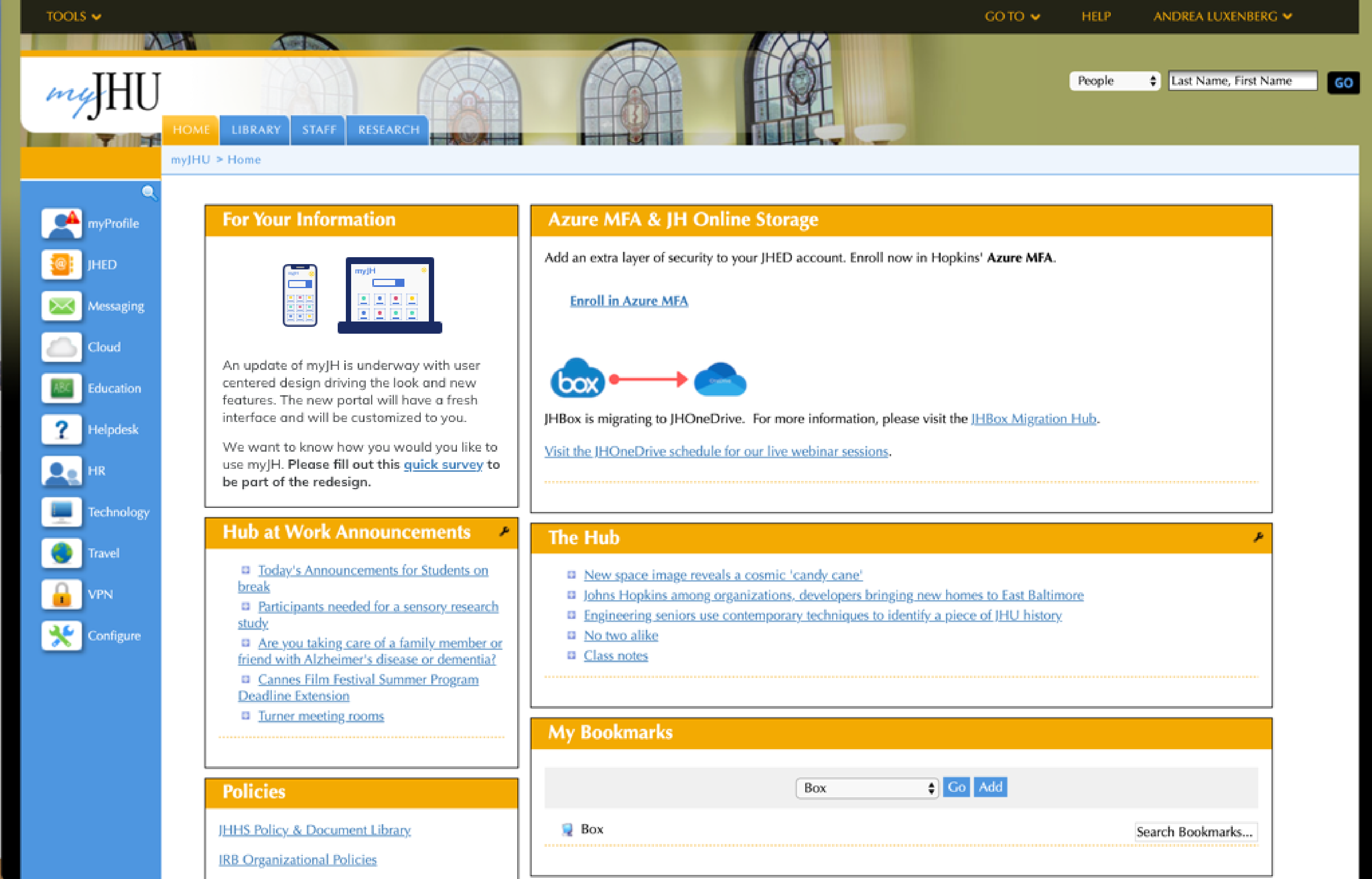
Johns Hopkins is the leading research institution in America. The myJH portal is used by over 130,000 students, staff and faculty. While previously each of the 9 schools at Johns Hopkins had its own version, we were tasked with creating one common interface that serves all users. Going forward this digital front door will help launch Hopkins into providing more digital self service and customization for its community.
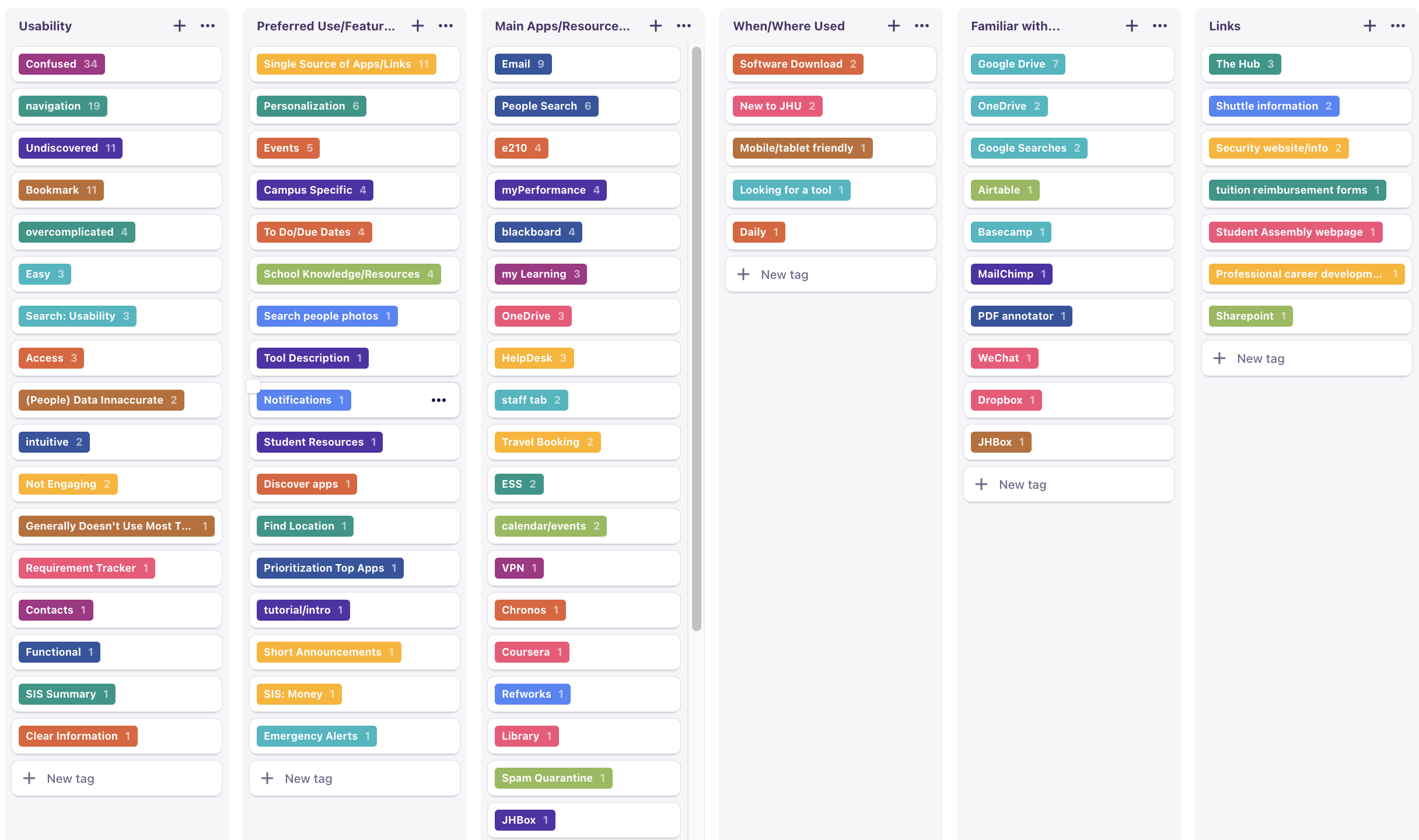
I lead design research and UX/UI design. Methods included user interviews, usability studies, surveys and card sorting. Design tools included Dovetail, Optimal Sort, Miro and Adobe XD.
Team: Kelly Lynam (PM), Kim. Le (UX Research), Amy Hushen (Graphic Design) and Katie Patras (UX Design).
Our team built a prototype that we tested in February, 2020. We launched our hi fidelity design in Summer of 2020.
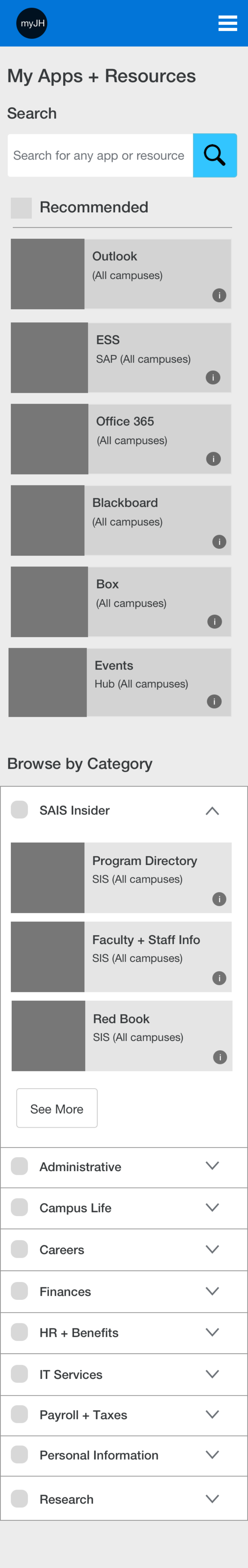
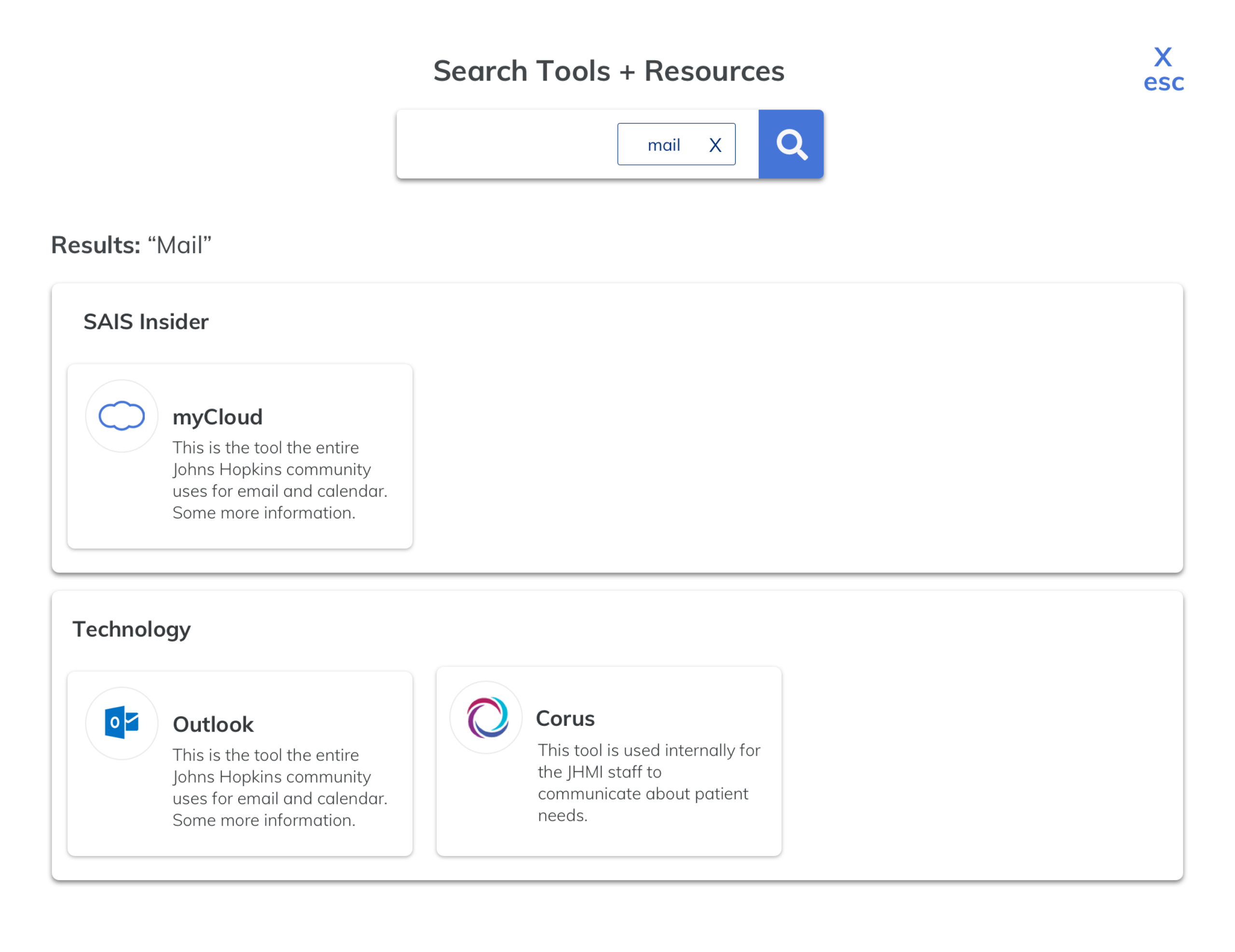
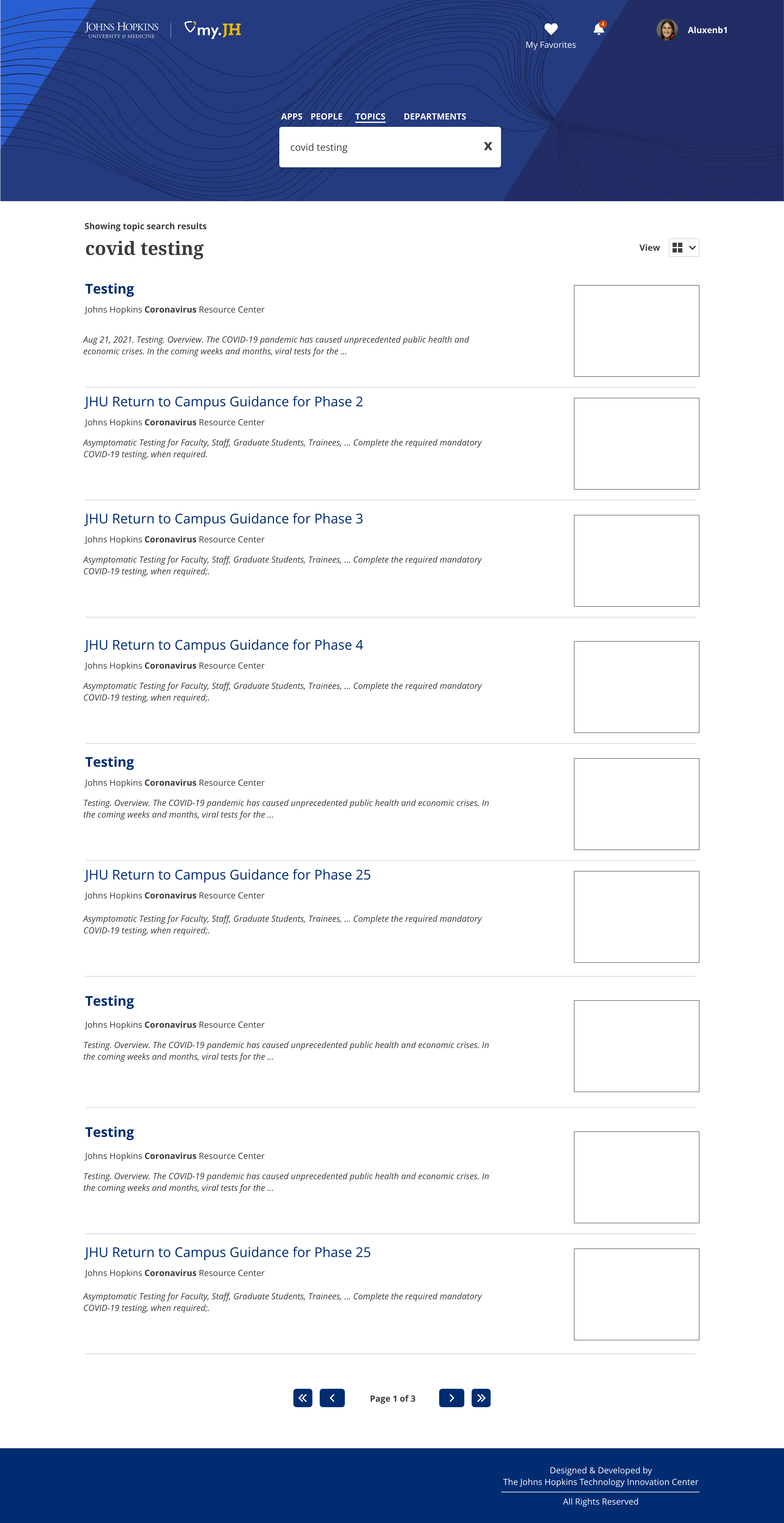
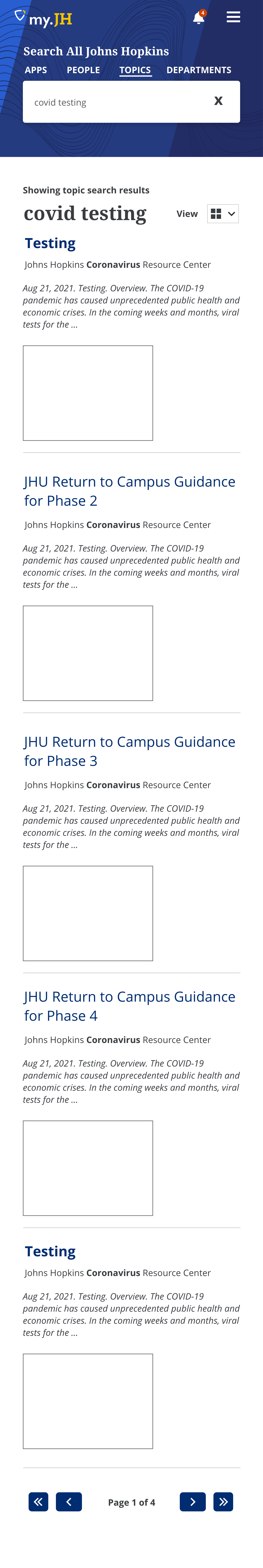
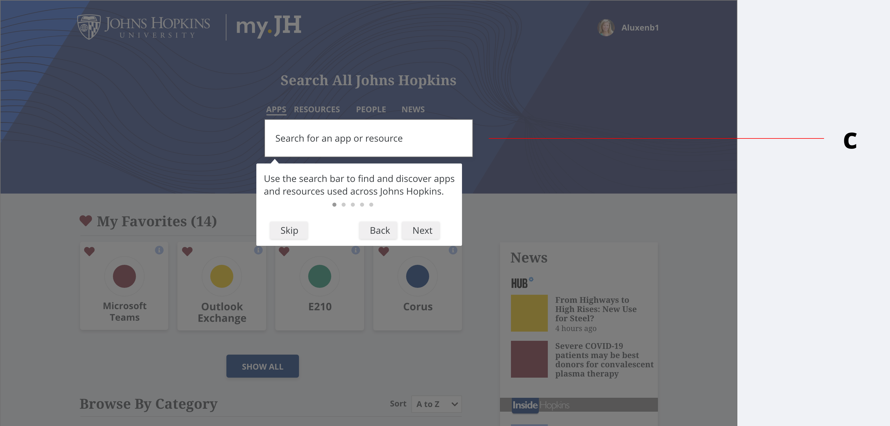
myJH is the first system that all Hopkins community members use. It is where users go to find over 200 tools and resources. Users also search for content: contact information, news and general updates. In 2019, users were on the site for an average of 3 minutes. The goal of our first iteration was to enable users to get to where they need to go even quicker. In 2019, only 10% of users access myJH on their mobile device. We wanted to improve the experience on mobile.
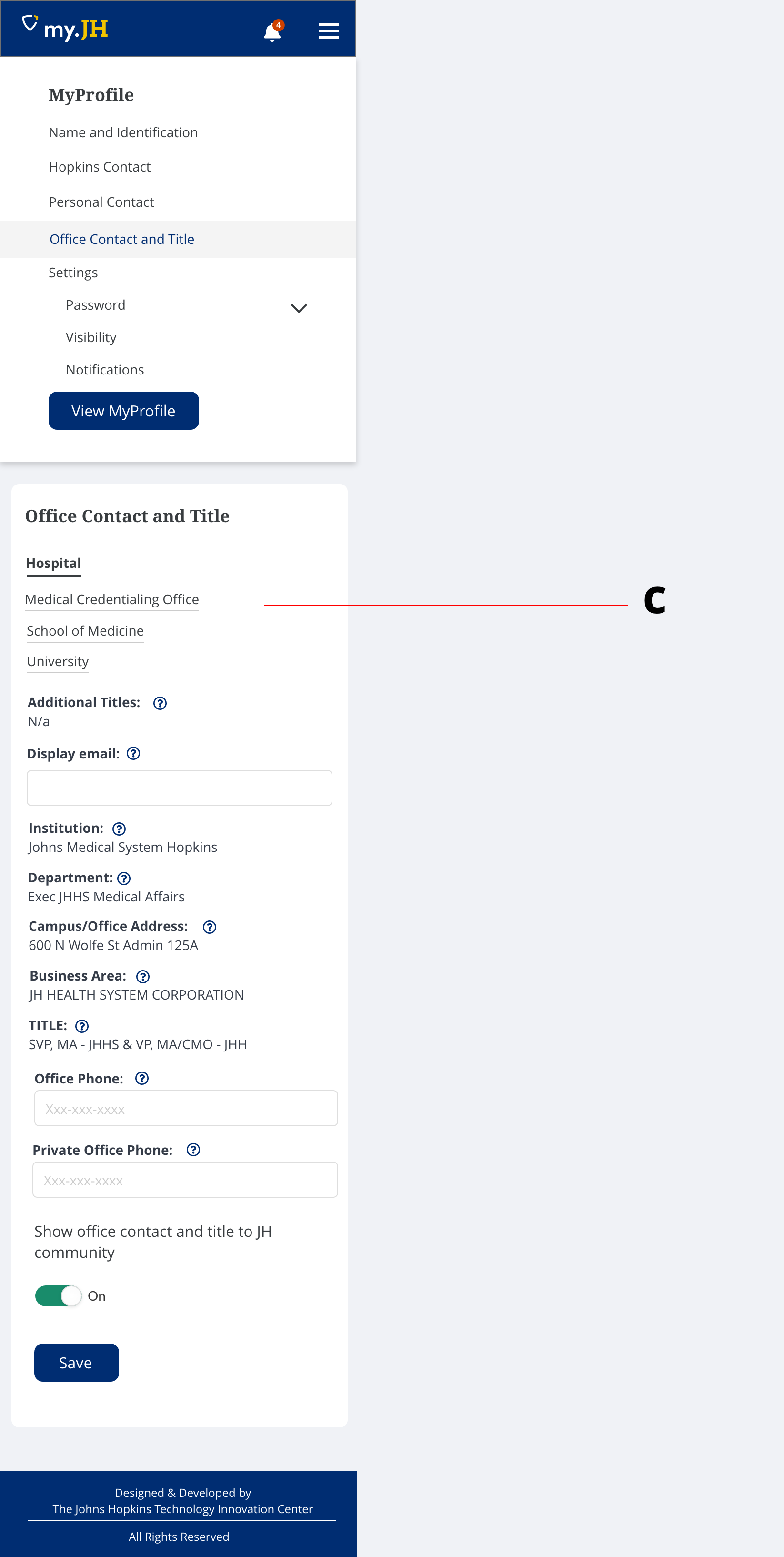
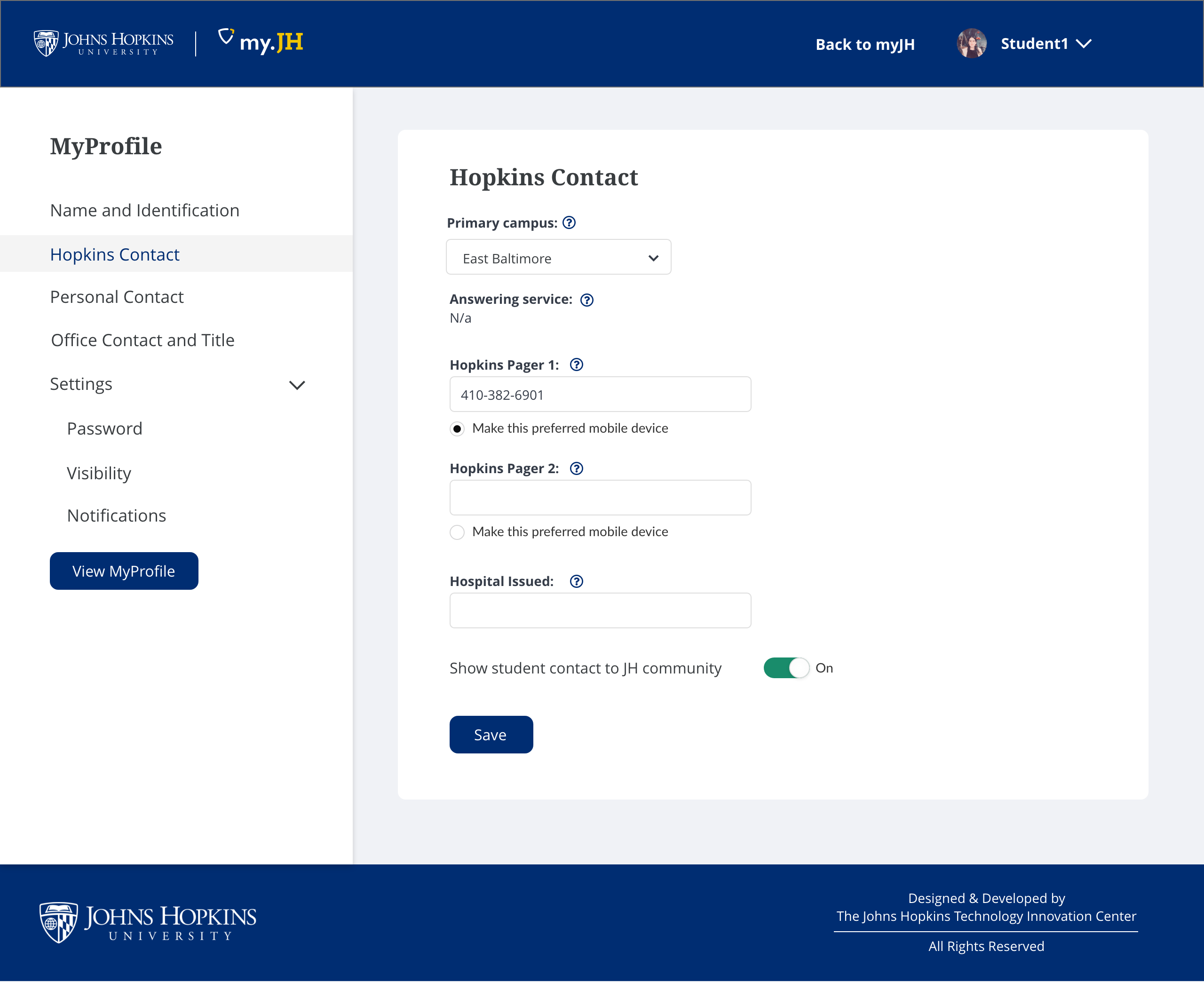
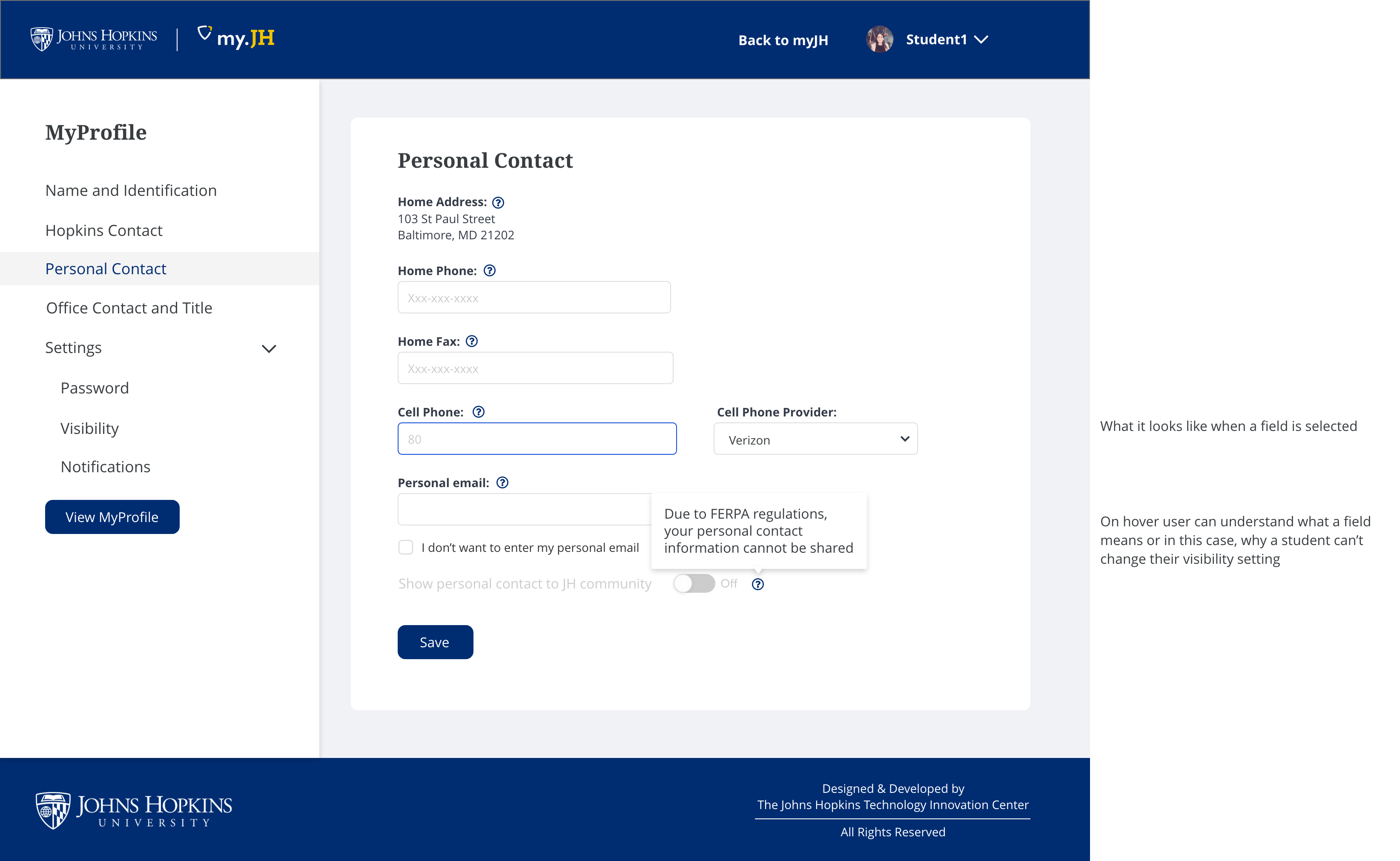
We needed a tool that matches Johns Hopkins innovative, collaborative culture. Historically, schools at Johns Hopkins had their own portal. However, many people at Johns Hopkins are affiliated with multiple schools or campuses so we wanted to create one interface that enables customization by role, status, and campus location. We aim to create a unified digital experience so that data from our various systems are in one common interface and design system. myJH aims to be that place.
We followed a User Centered process to look into the current challenges. We want to understand the main features used and what integrations our community would like. This conversation is the beginning of a long journey to improve the digital experience for students and staff.
"myJH requires endless casting around for stuff I'm looking for. I appreciate the effort to try to put it in all in one place, but the user interface is like trying to fly a jet." - JHU Staff member
"It's as if the system is constantly trying to break me down, invalidating my sense of self, and reminding me that I have virtually no power in my relationship with the university." - Trans community member
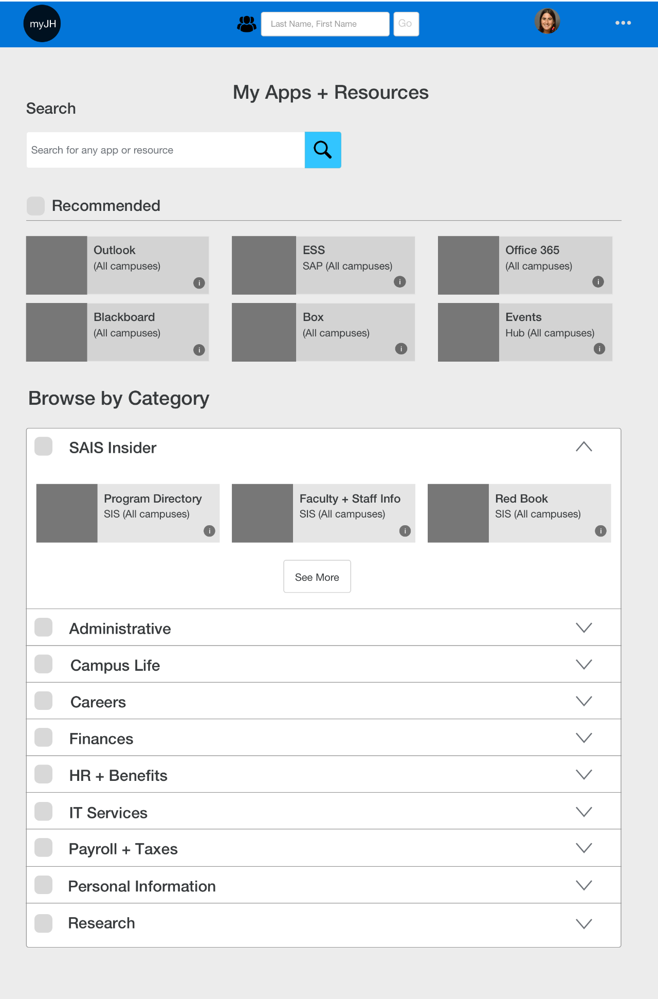
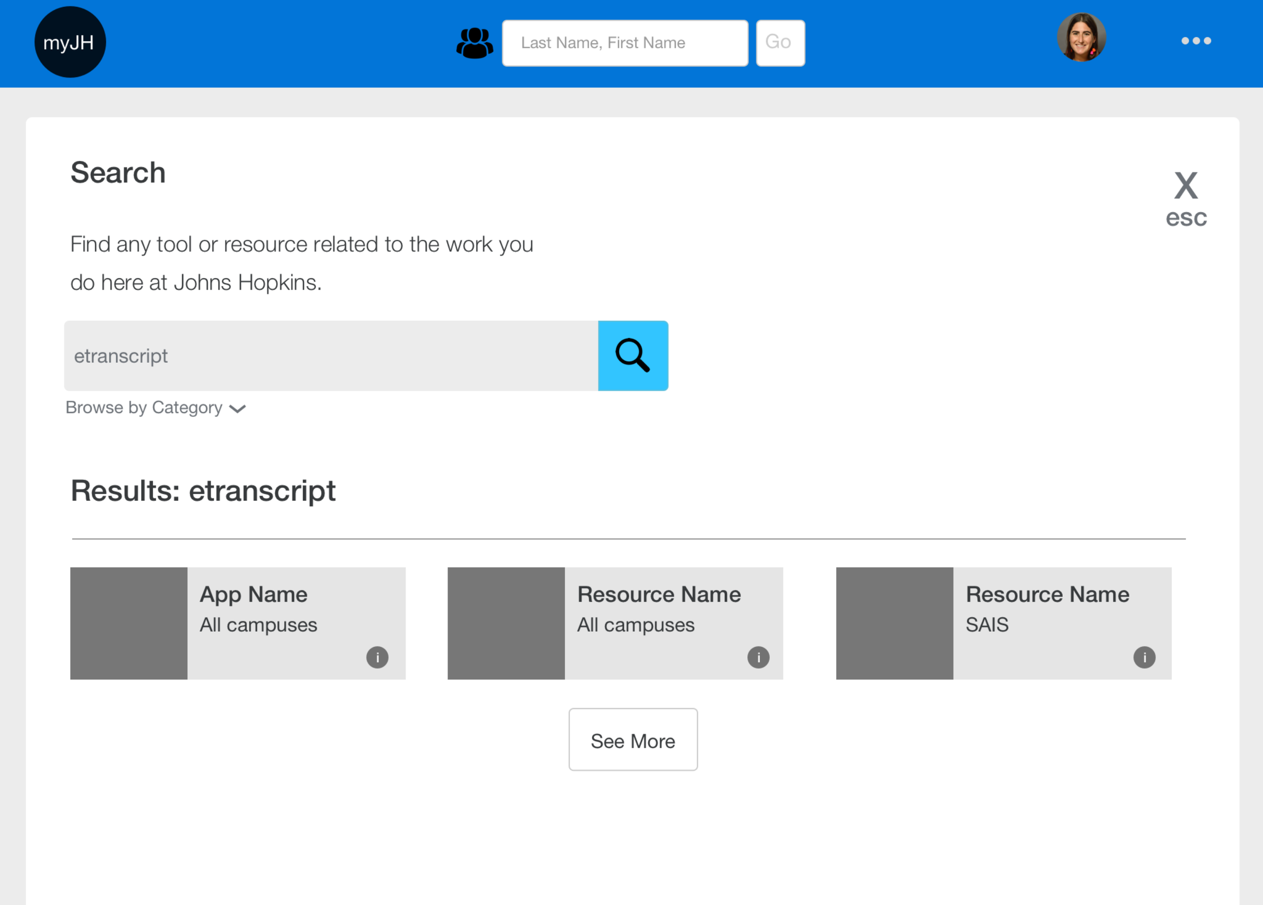
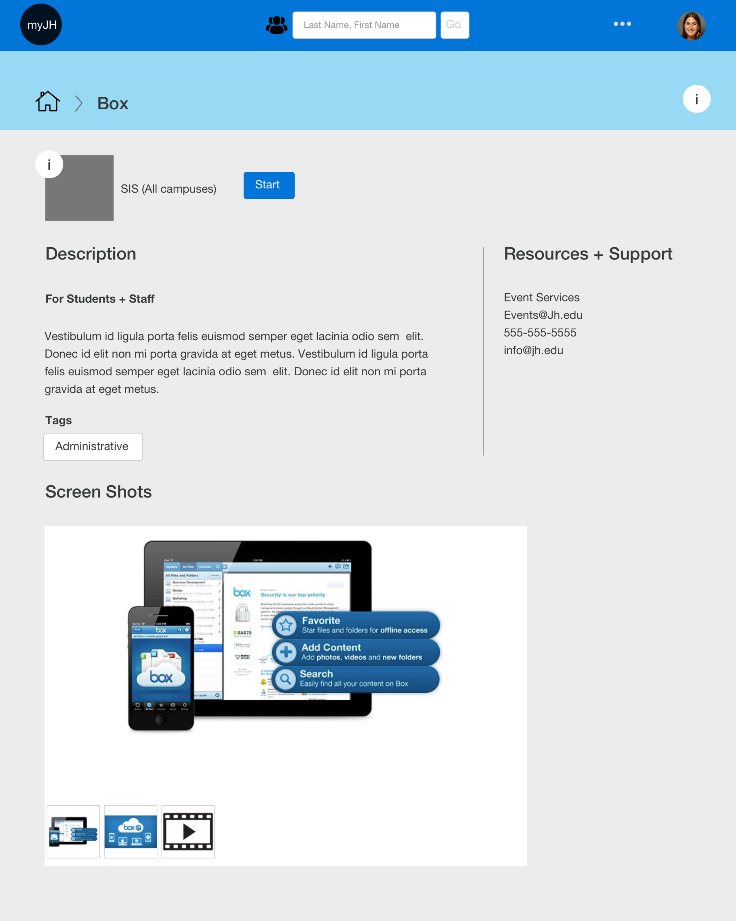
After showing our wireframes and getting buy in from our team, we moved on to creating a testable prototype. The goal was to test a few core features including search and finding information related to tools and resources. The design has minimal branding. We wanted to minimize change during the pandemic. However, we launched an alpha version during the spring of 2020 with the ability to toggle between the two systems through the summer.
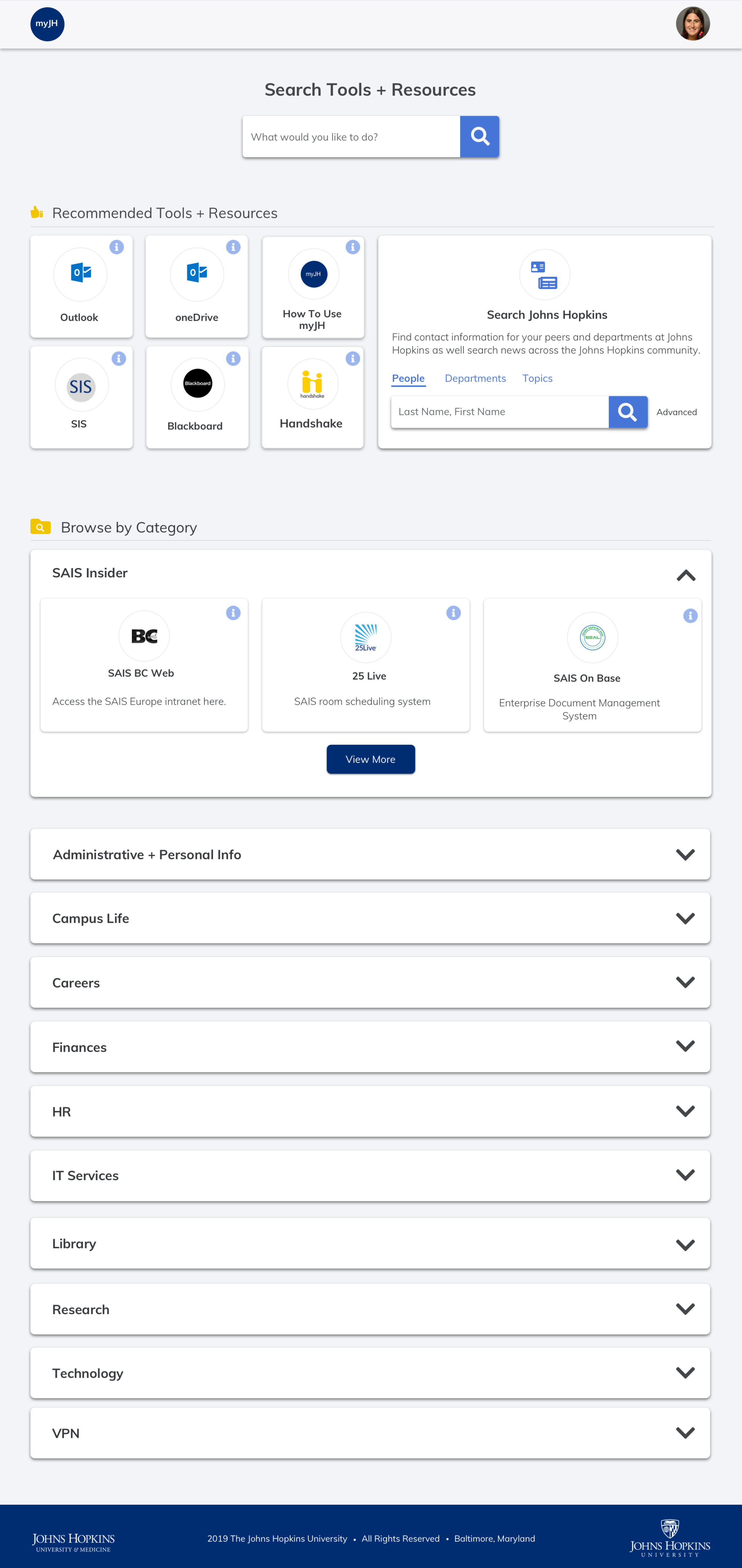
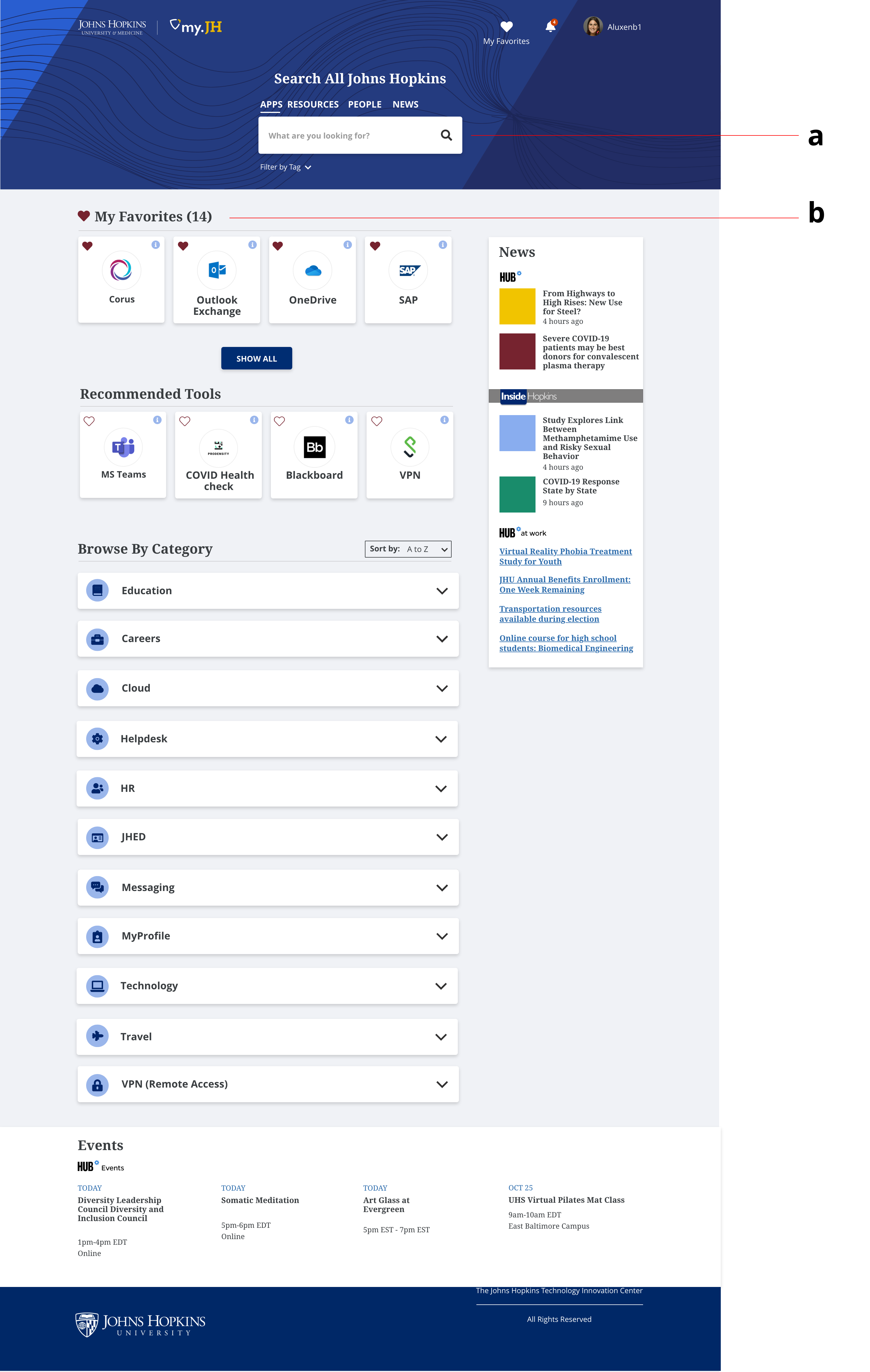
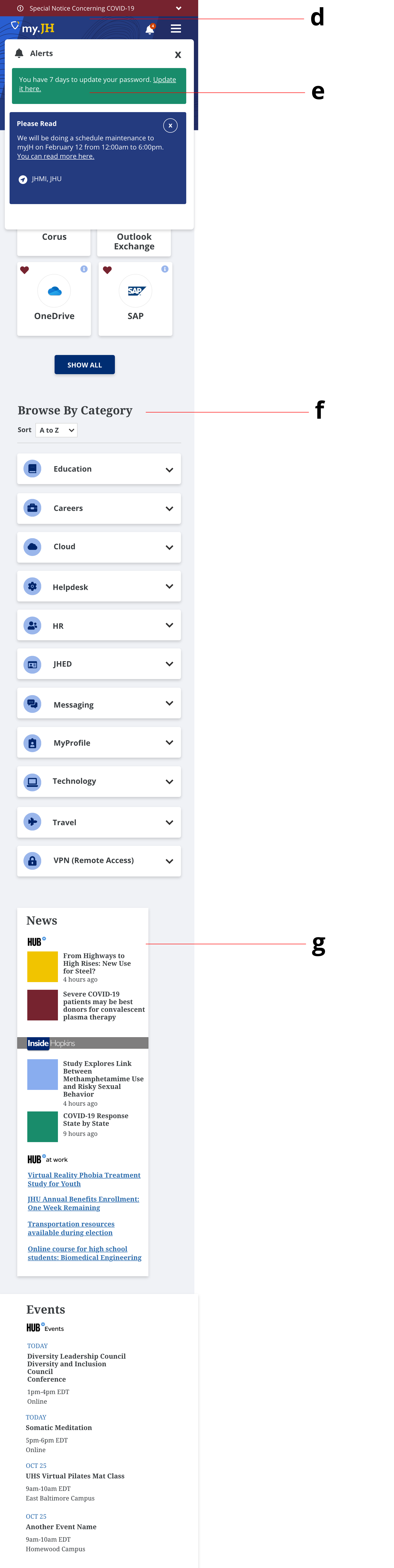
Users have appreciated the new look and feel of myJH and particularly like the ability to favorite apps. We saw a 13% increase in mobile usage, from 10% to 23%, in one year. Within one year, we saw the average session duration go down to 50% from 3 minutes to 1.5 minutes. Users are able to find their key information fast since the main use case for the tool is still to get users connected to the apps, resource or key information they are looking for. Our favoriting feature has allowed for a personalized Hopkins experience; 35,000 users have created 159,000 favorites.
We had 241 responses to our feedback form we reviewed in fall of 2020. Overall, the feedback has been positive with some negative feedback. 21 people think there is too much scrolling. Additionally, 25 people want the ability to organize their favorites.
“Not being tech-savvy, I was dreading the change... It is the first time I find the new version of a website actually better than the old one (it always takes me a long while to adjust to technological updates). I immediately liked the new look and I find the access to every function very user-friendly.” JHU Staff
Johns Hopkins still has many digital tools and systems. The next step will be creating a digital dashboard that pulls in and displays data from these systems. We plan to give users to have a view of key tasks and information related to their role. We also have not implemented notifications yet as we are developing a cohesive plan with other departments. There is also an opportunity to improve the content management of myJH. We will work on creating role based views for students, staff, faculty and alumni which is also based on campus. Unfortunately we find that tools and resources are not always added to myJH, causing frustration for the user. We will be working closely with students and staff to design the next phase of the Johns Hopkins digital experience.