
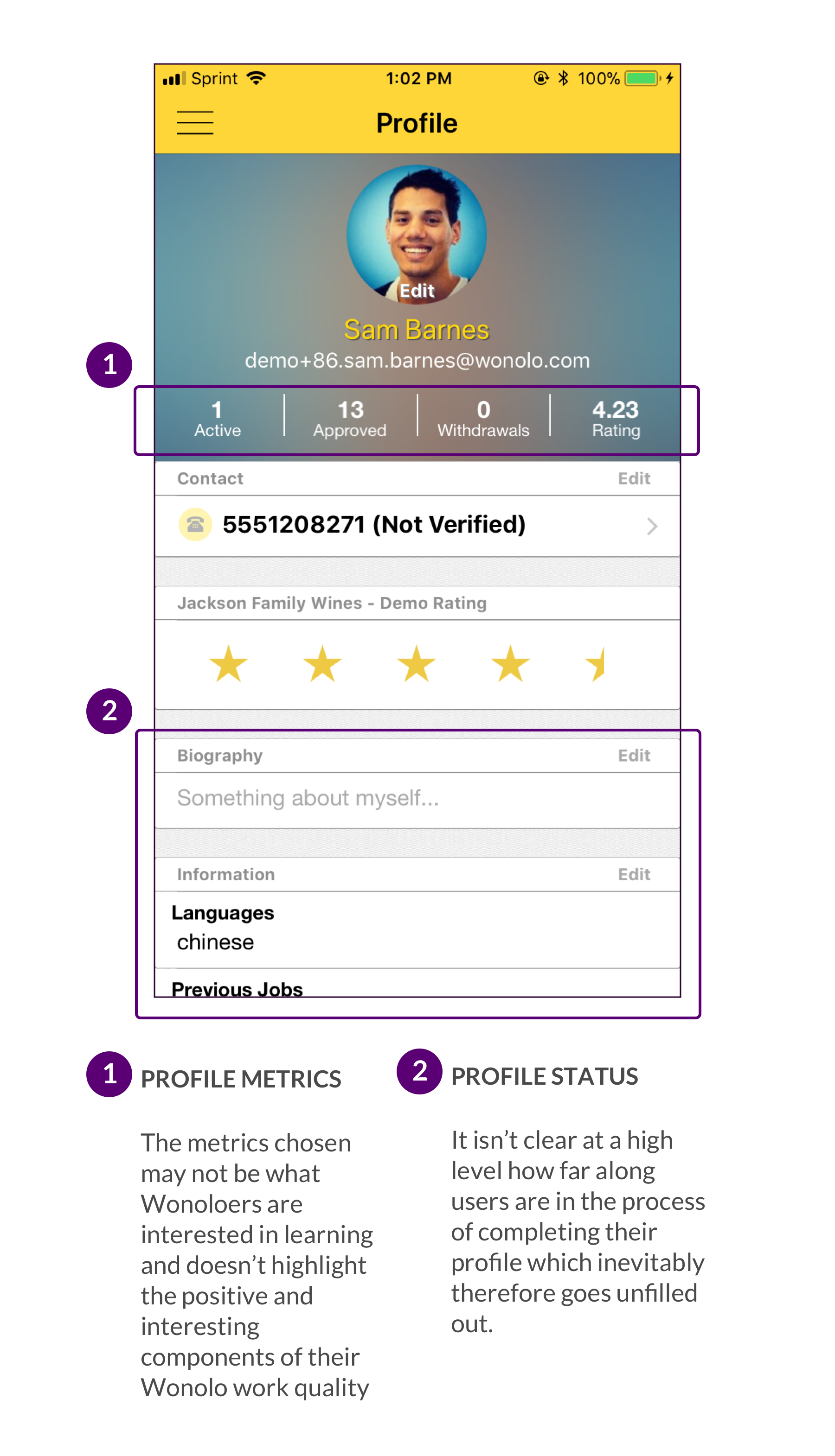
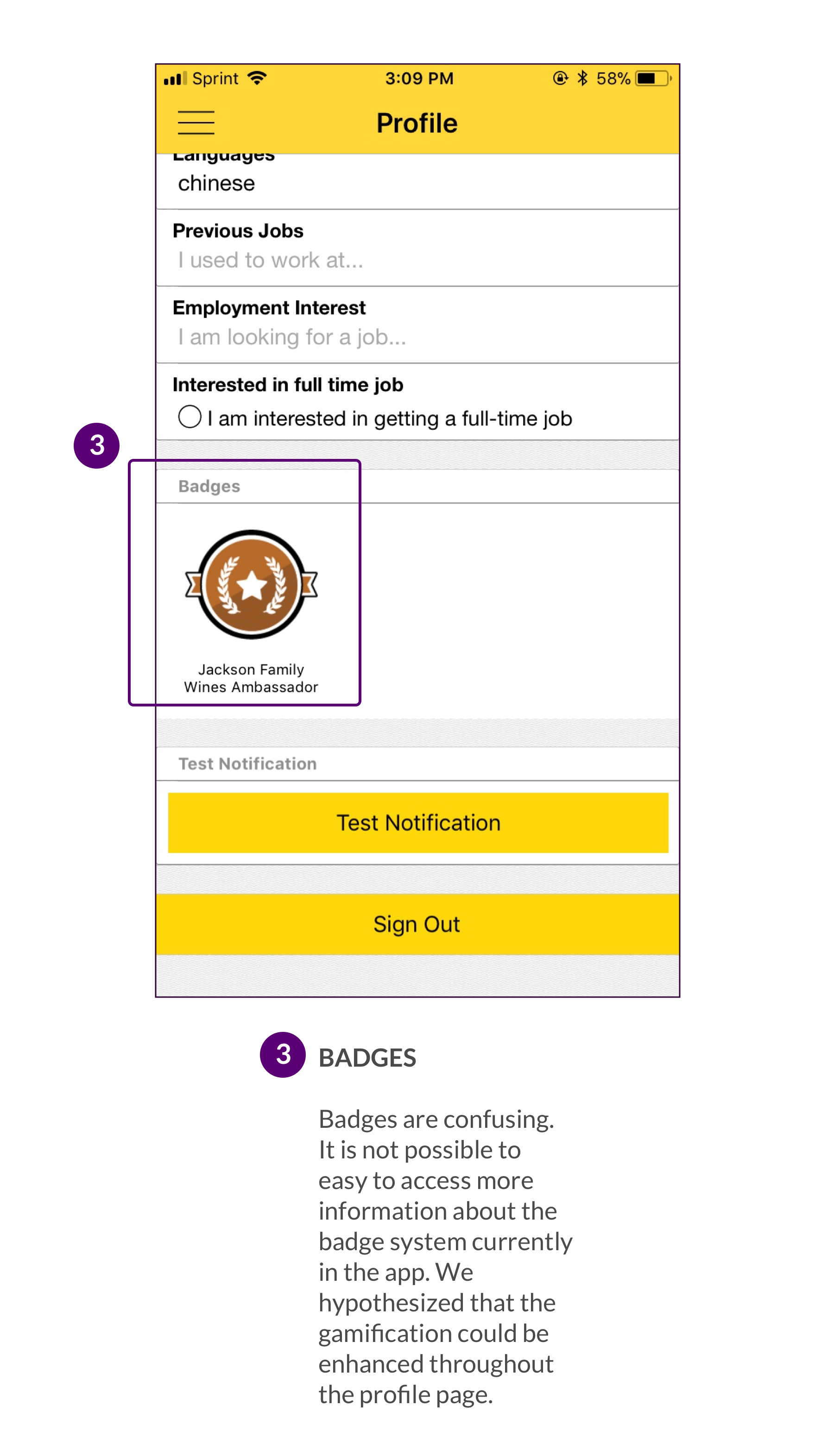
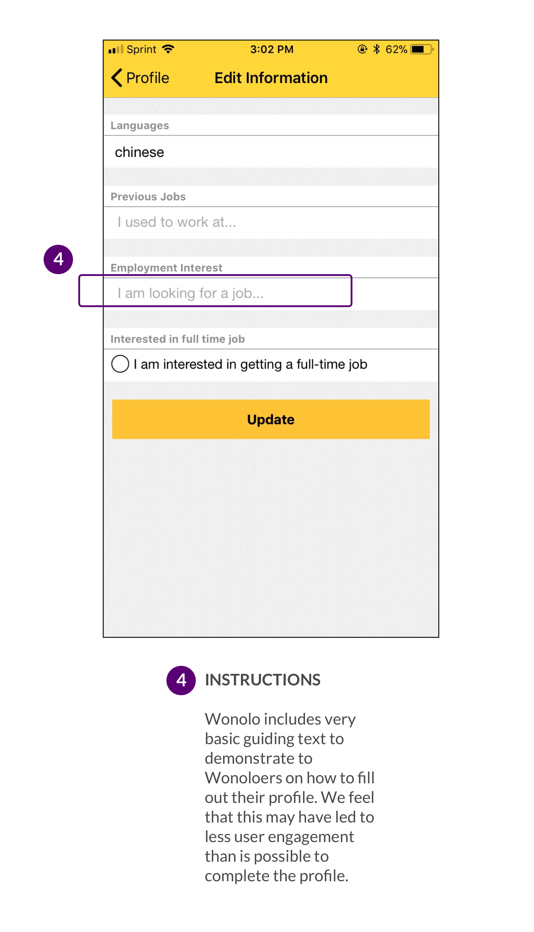
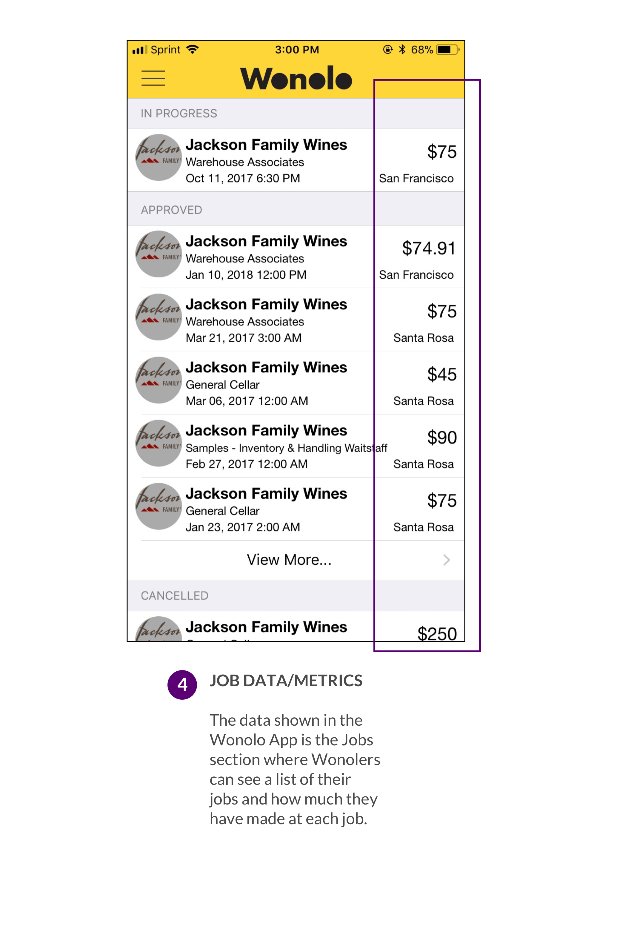
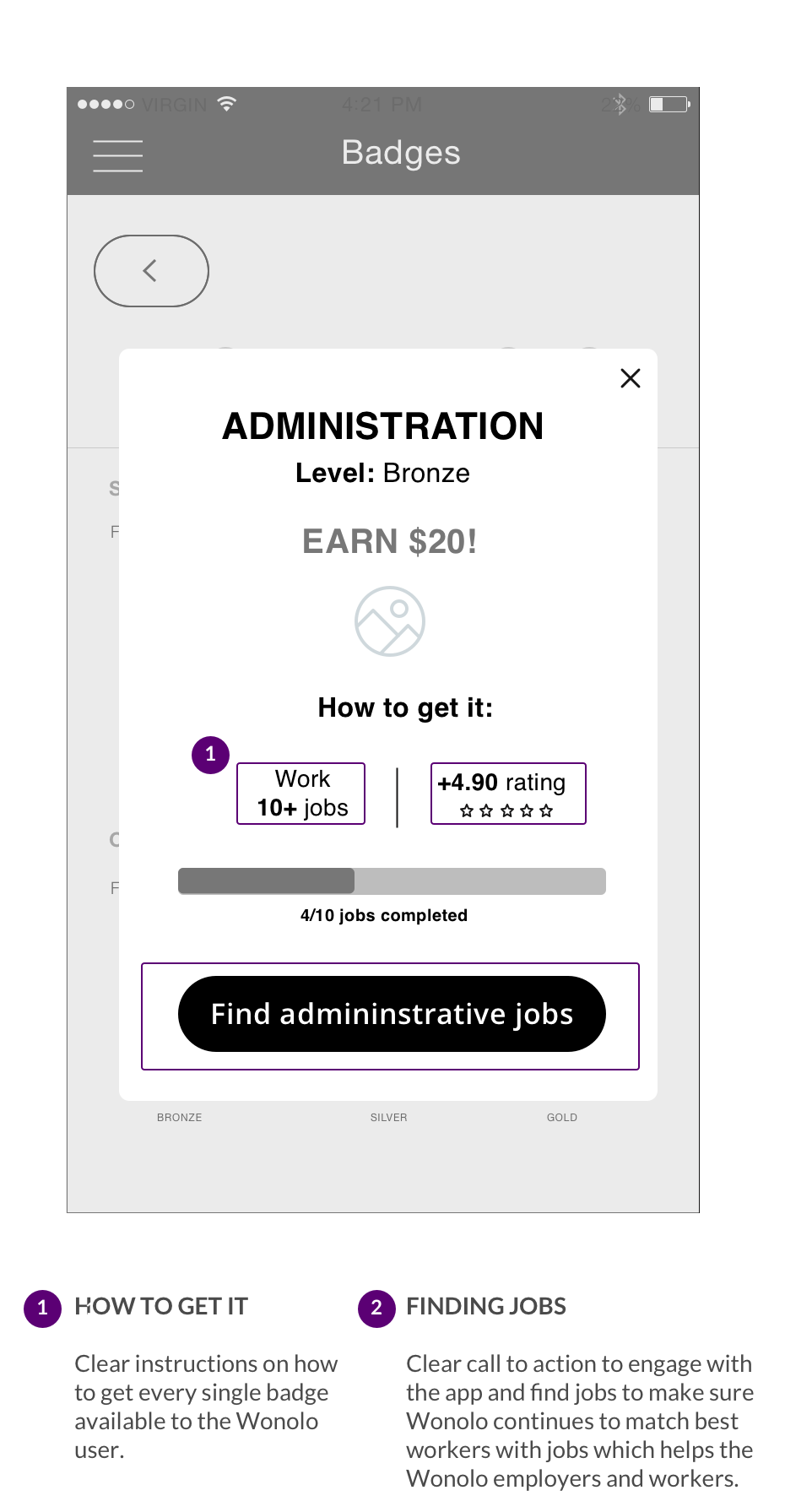
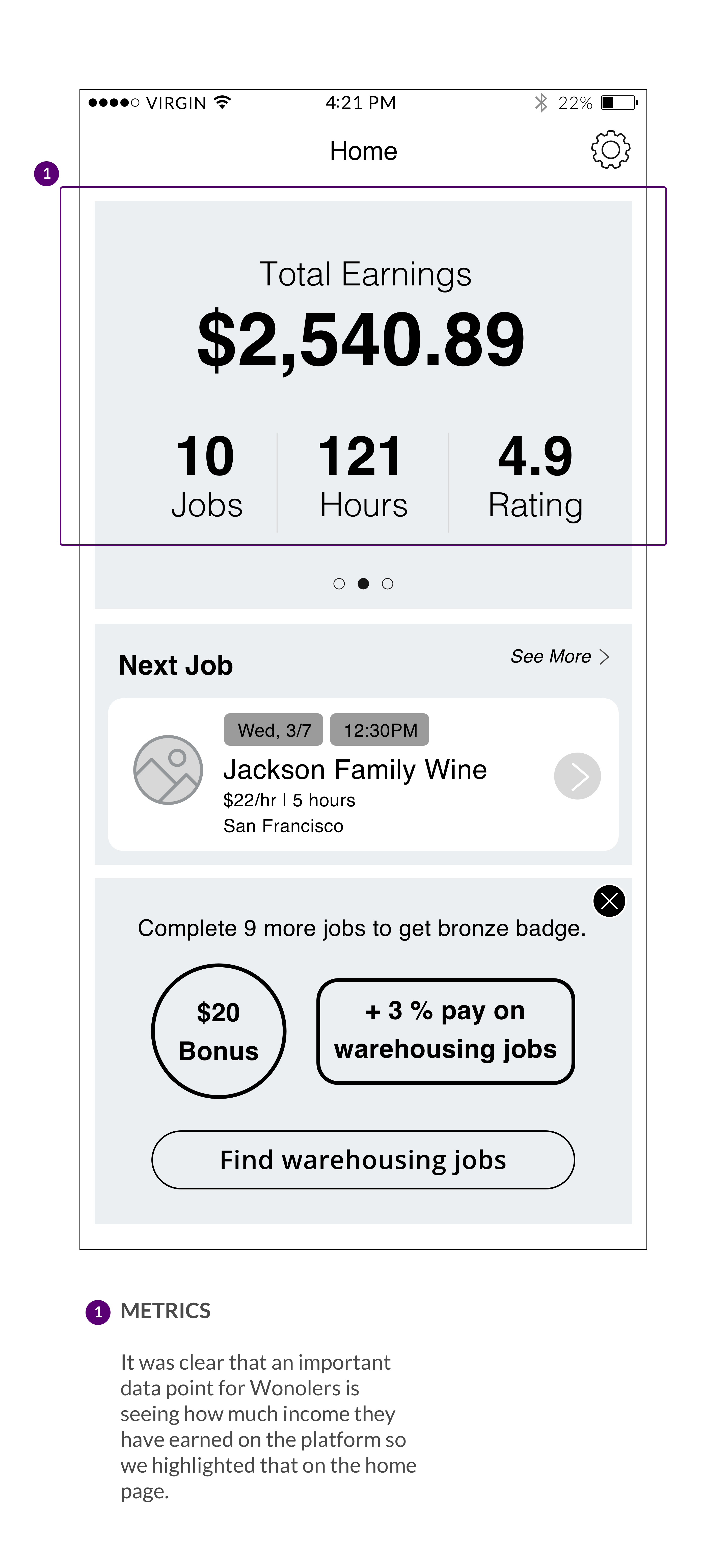
Design an informative and robust profile page for Wonolo workers that improves engagement, increases accountability and incentives better work performance through gamification.
In 2020, Johns Hopkins launched a Shared Services Organization that combined three functional areas: student accounts, registration and financial. This new team is tasked with providing services to students related to their overall enrollment and finances.
My focus has been overseeing the end to end UX design process. I have also worked on branding, graphic design and UI design. Methods included: user interviews, shadowing, co-design sessions, usability testing, affinity maps, surveys and journey maps. Design tools included Dovetail, Miro, Adobe XD, Figma, Invision.
Team: Nicole Pennington (PM), Kim Le (UX Research), Sarah Elvidge (Project Manager) Sam Vehslage (Marketing)
Over 100,000 students have used our new tool, a case management tool (Salesforce). We also built a website and brand for the new shared services organization.
Johns Hopkins students historically struggle to complete administrative tasks. From registering for classes, to reviewing their bill, students find themselves confused and frustrated. Students were shuffled between offices and even campuses which adds stress to their already taxing workload. With the amount of teams and digital touch point, students receive inconsistent information which leads to a poor user experience. We are working on designing an improved digital experience through the introduction of a case management tool (Salesforce), among other technological investments and design updates. The case management will create a more transparent support process and improve communication between staff and students. Our work was accelerated by COVID-19 as our students were sent home and everyone became an online student. We could no longer rely on office visits or the collaborative nature of our campuses. Combining three offices into one has been an organizational change and has caused some unease especially on the staff process during the global pandemic. Our task was to improve our interfaces to help ease both our staff and our students into this transition.
Following a user centered design process, we looked at the current challenges faced by our users. We have included students in each step of the process to ensure their voice is heard. We have included students in everything from usability tests to voting on the name of this new office and service.
While institutions like Johns Hopkins provide an invaluable education and experience to students, their digital tools and systems often seem outdated as compared to other industries. We had the following assumptions of what we sense our users are struggling with:
We watched students in their natural environments; on their laptops working through tasks as well as visiting offices to get help. We could see the frustration as students are told that there is someone else to talk, another form that needs to filled out and/or a process unique to their school or scenario. We tracked interview notes from our interviews in Dovetail. From those notes, we used Miro to analyze the data and see the patterns that emerged.
Students like the option of having key information displayed in time-based and visual formats (calendar views, matrices). Hopkins students build their own systems to do this.
Personalized information is needed so that students see answers relevant to their situations. Many of our websites and tools lack personalization. For example, certain processes are different for international students.
Trust is built when communication is clear from a trusted often consistent person and or source. Students go to peers when staff/normal channels fail or if it is faster.
Students do not now or care about the distinction between administrative offices, especially student accounts and financial aid. When possible, we should talk about the task at hand and remove jargon.
I sketched wireframes and designed a prototype to test the case management tool. We tested a basic prototype to make sure we were on the right track and tested it over Zoom.
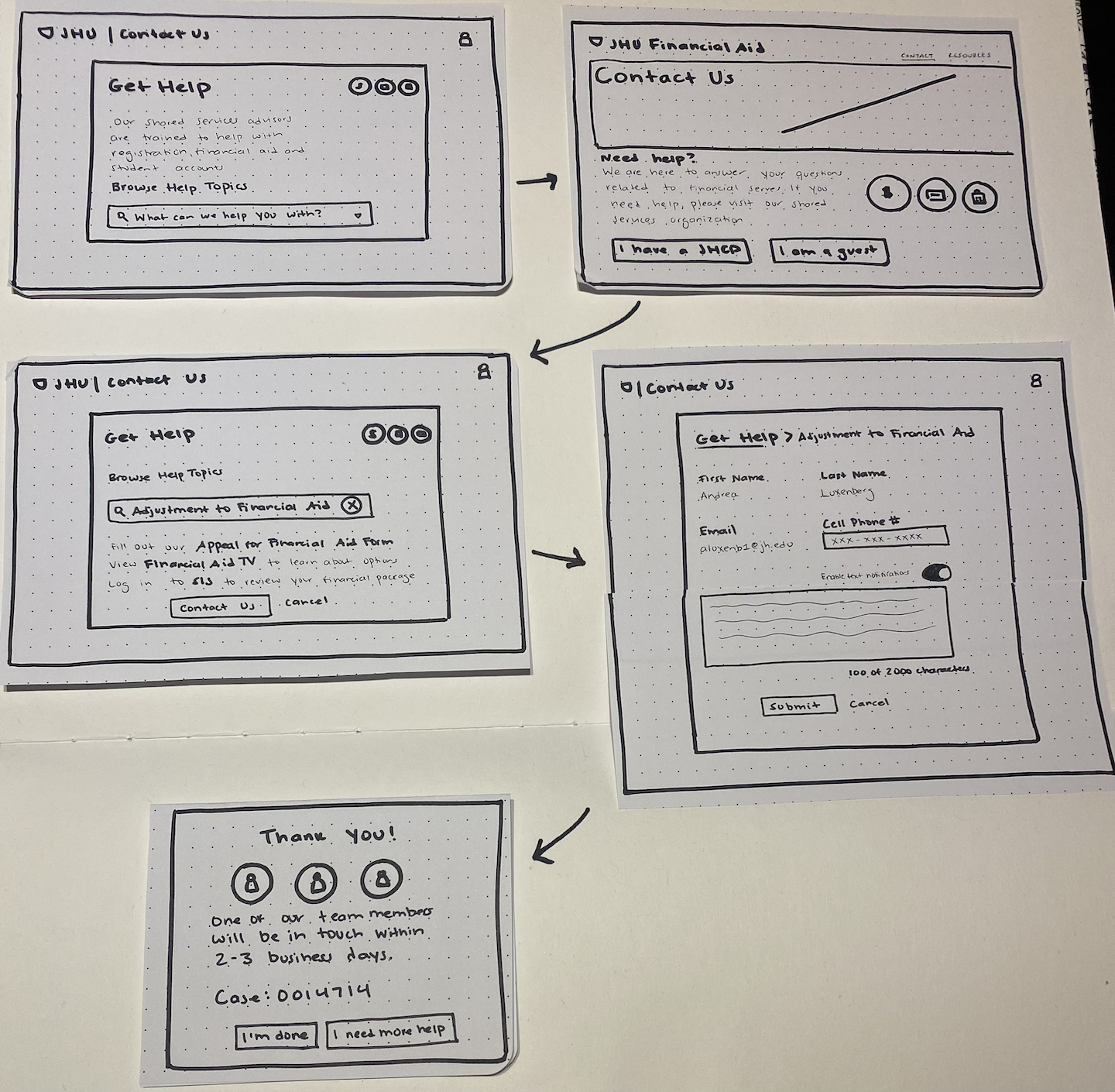
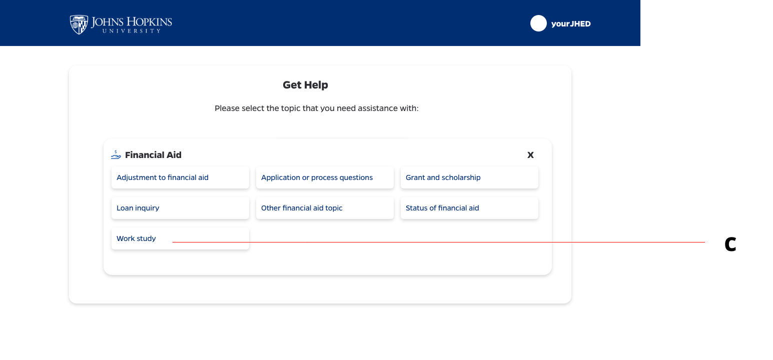
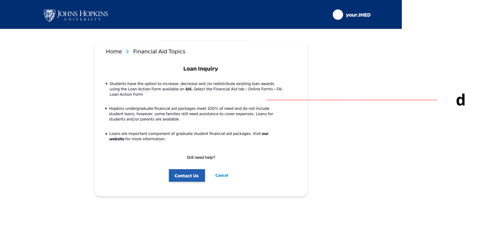
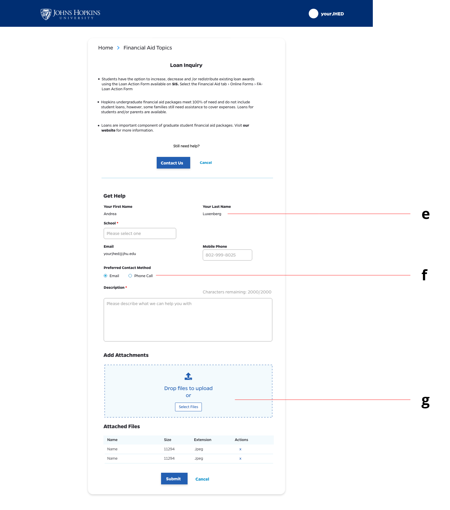
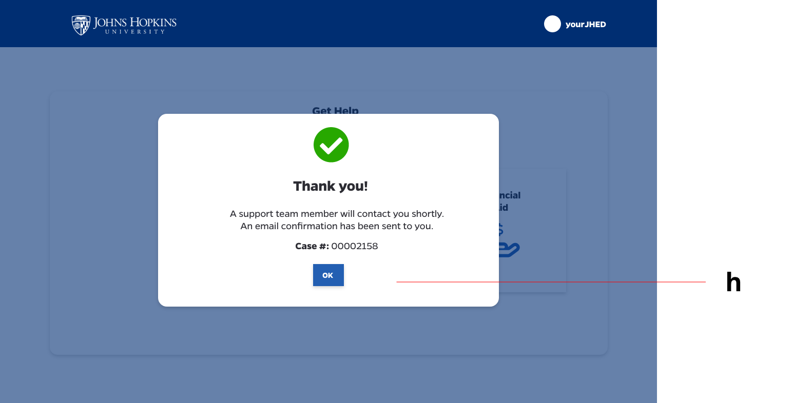
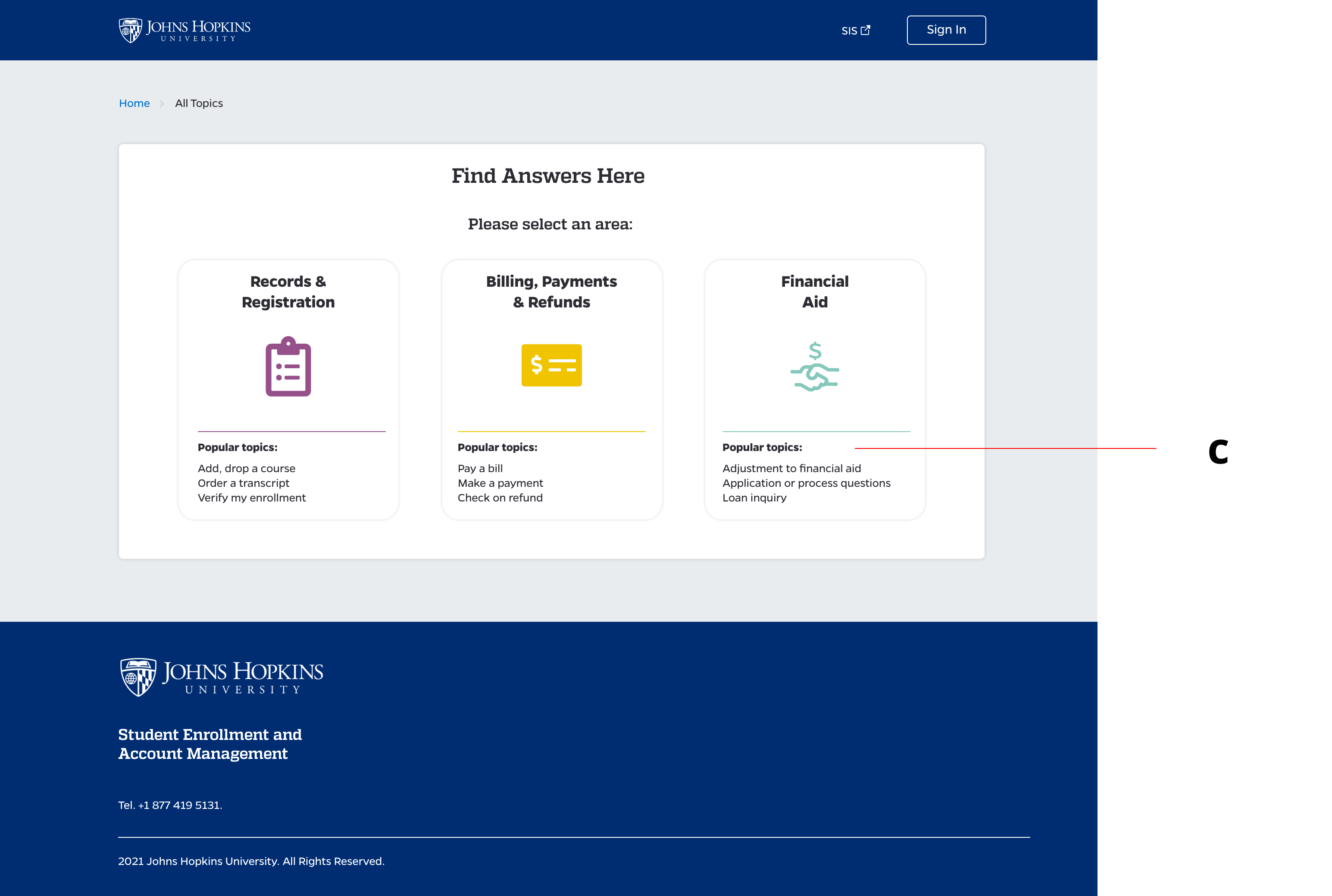
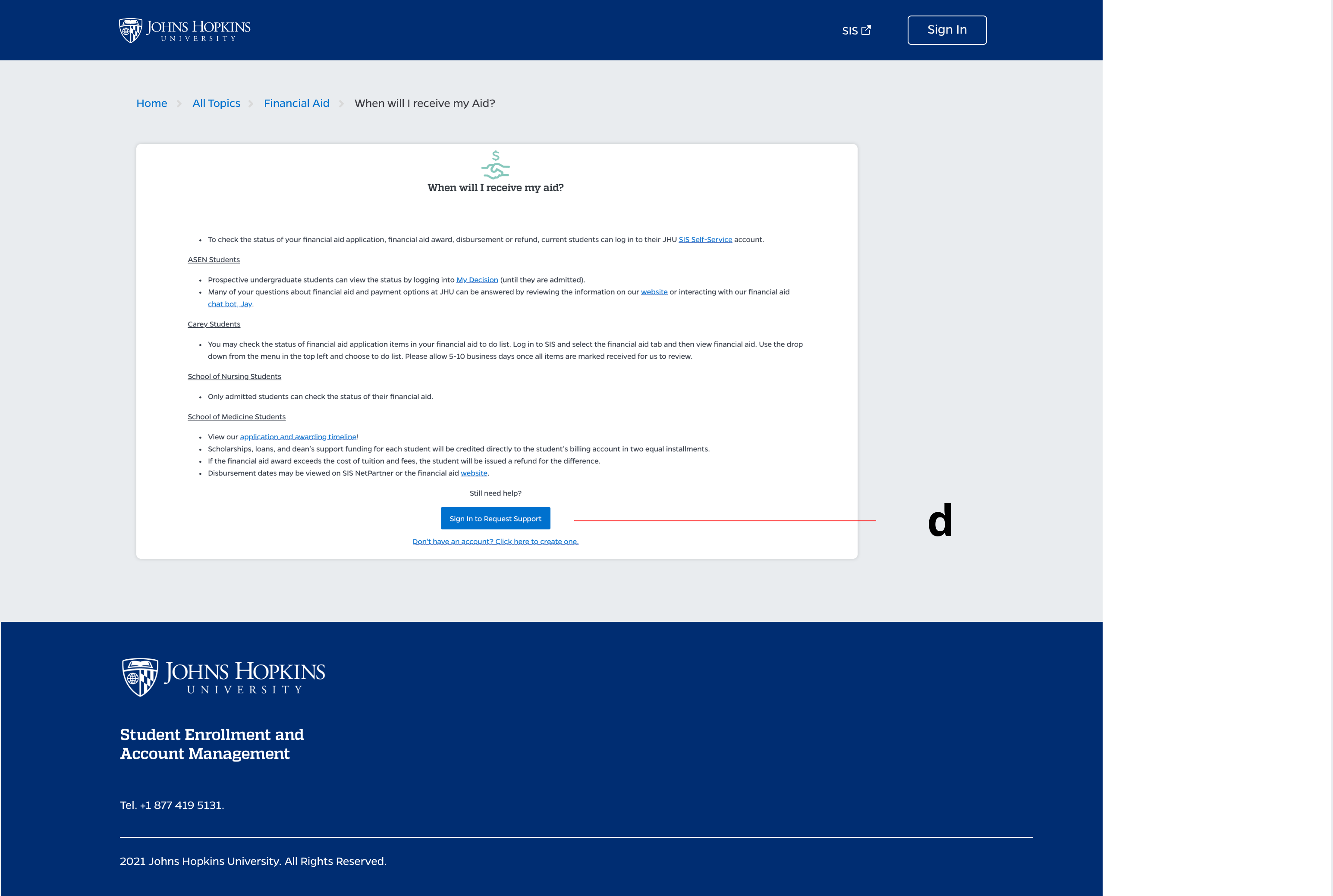
Before our department or tool had a name, we went ahead with a basic version of the case management tool that enables students to choose a topic, submit a ticket and add attachments. The user receives email confirmation once they have submitted a case.
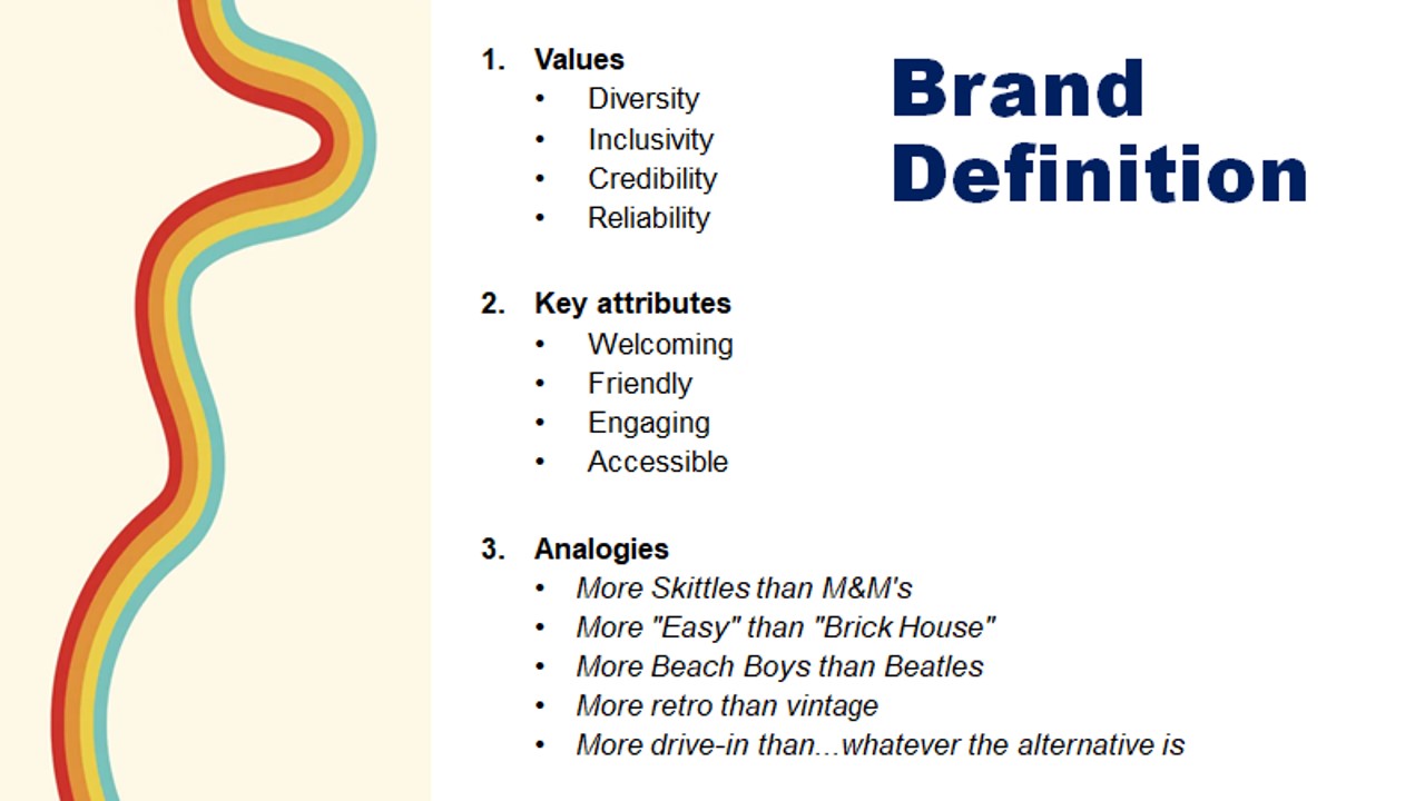
While designing the case management tool, we were working on officially launching the Shared Services Organization. We wanted to include students in this process to ensure we used clear and friendly language. I facilitated a co-design session with students to help create names for the department based on Johns Hopkins values and their idea of the brand.
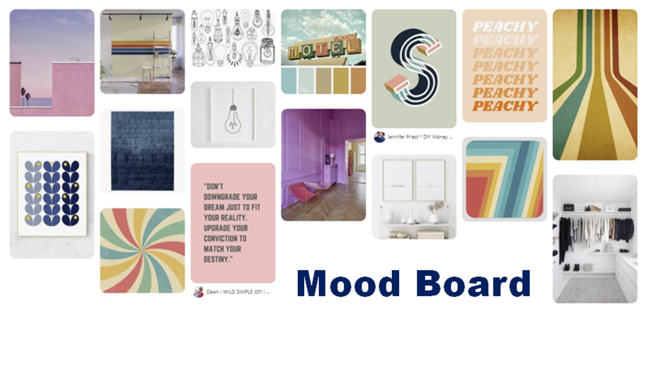
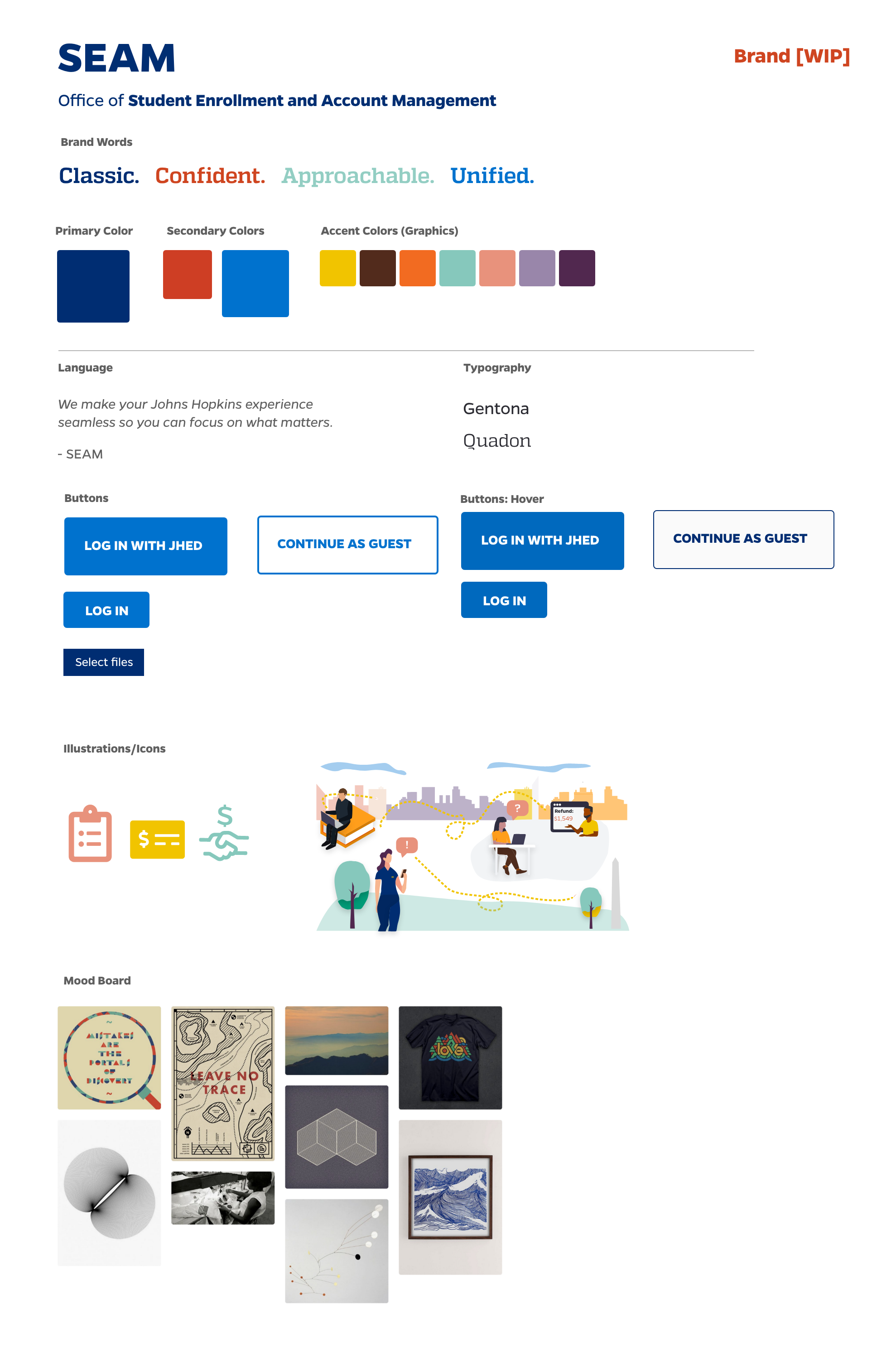
In addition to a name, we asked our 6 staff and students to create mood boards, choose styling and create a brand definition. We included 6 students and staff in this process. Below is one staff submission.
In addition to our student concepts, we received 89 name ideas from the community. From that list, leadership narrowed the list to 12 options. We had 45 students respond to a survey with those names. The students top name was myHopkins, however we decided that was too close to the myJH platform.
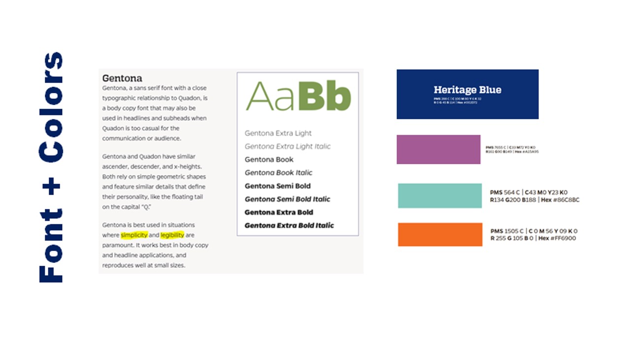
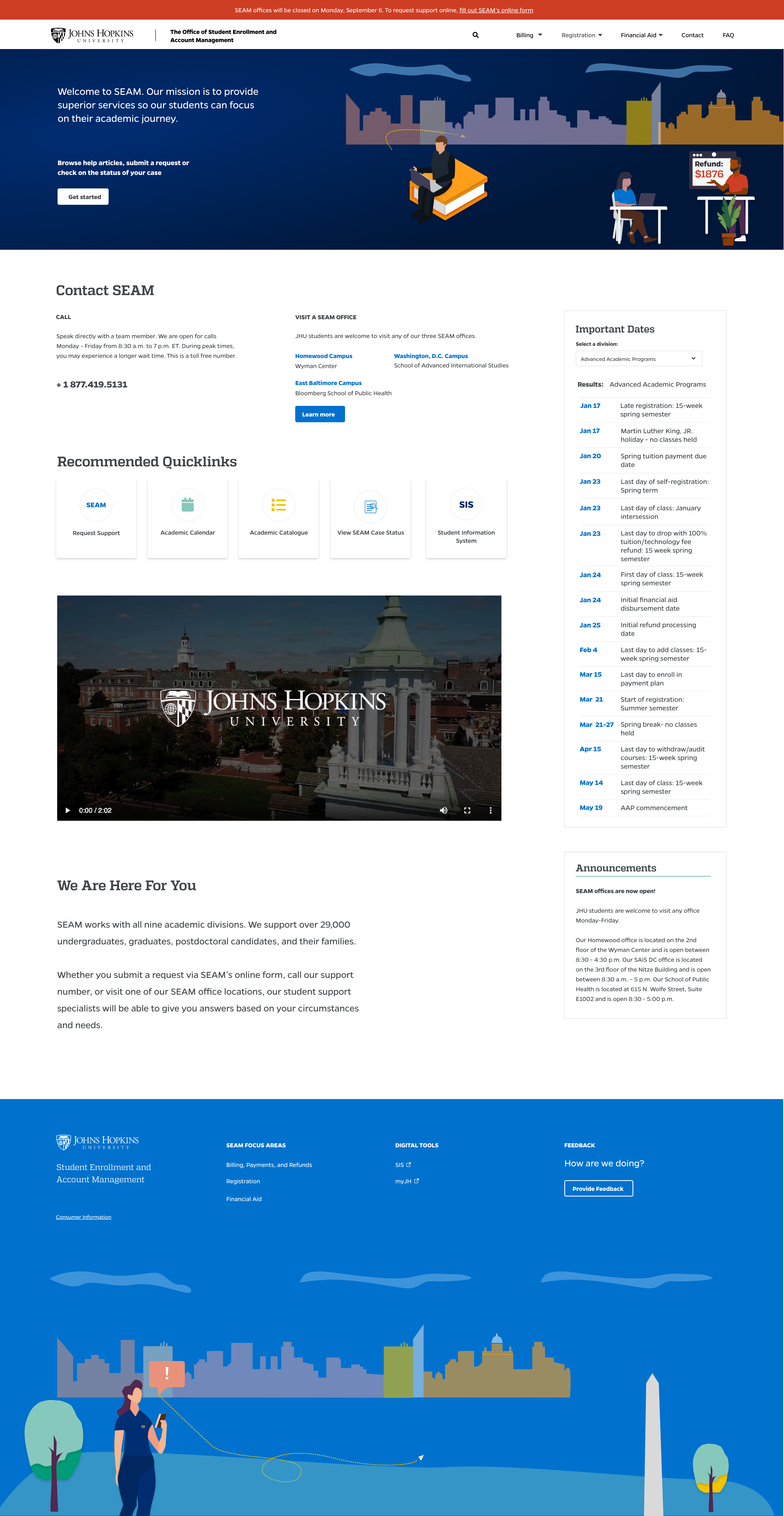
My concept, “SEAM” Student Enrollment and Account Management, was eventually chosen as the name. I created a brand guide. The home page for SEAM that was launched in the Fall, 2021.
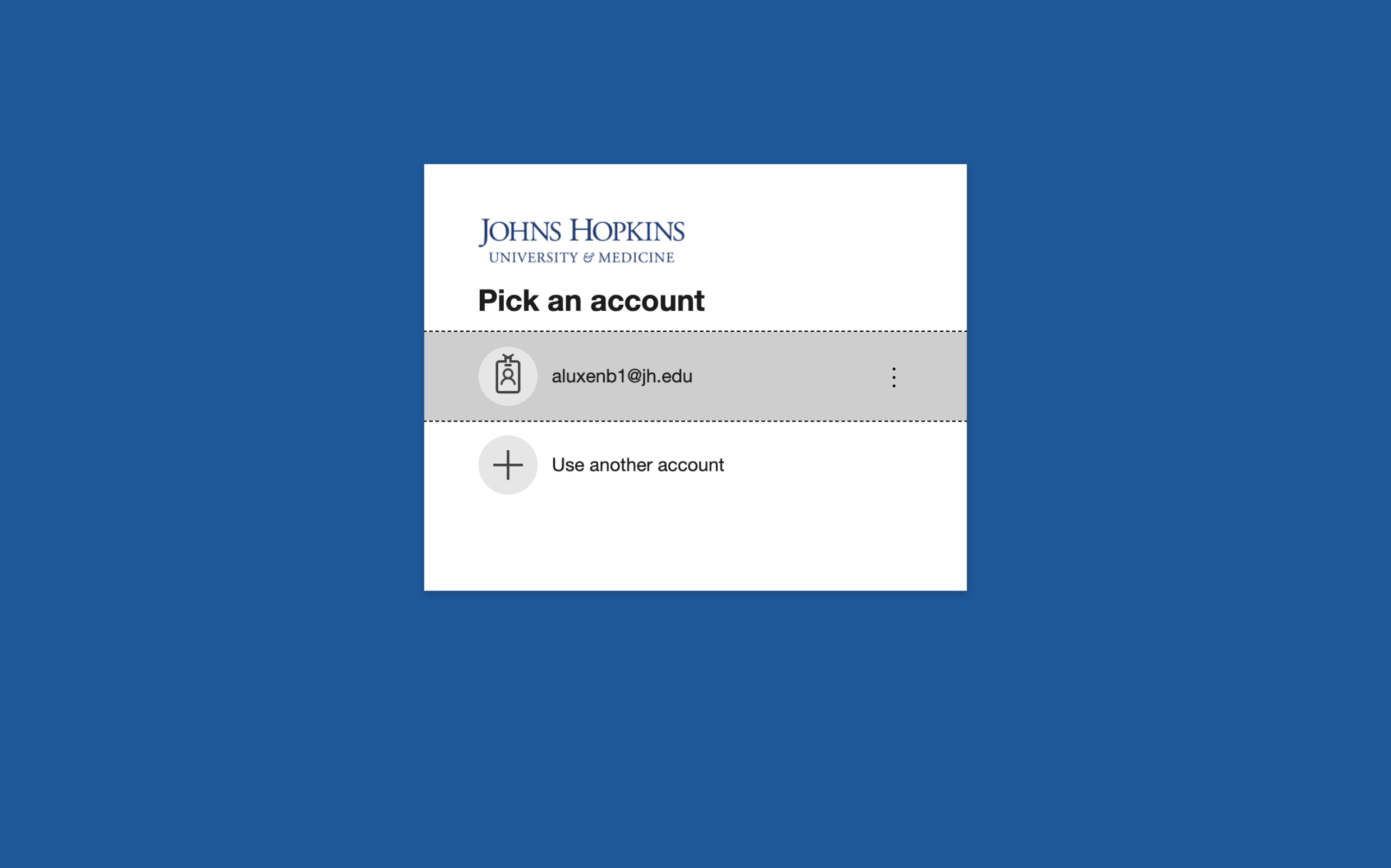
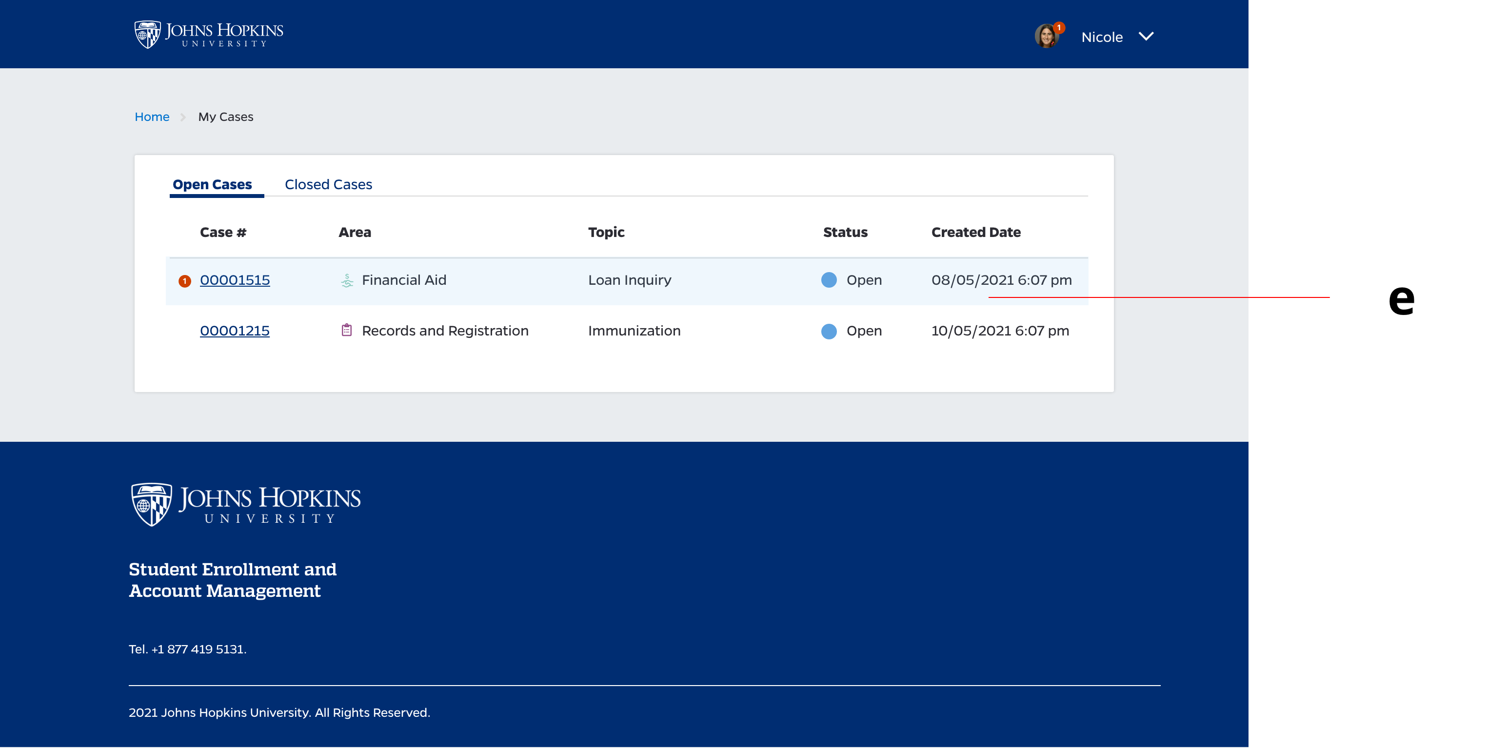
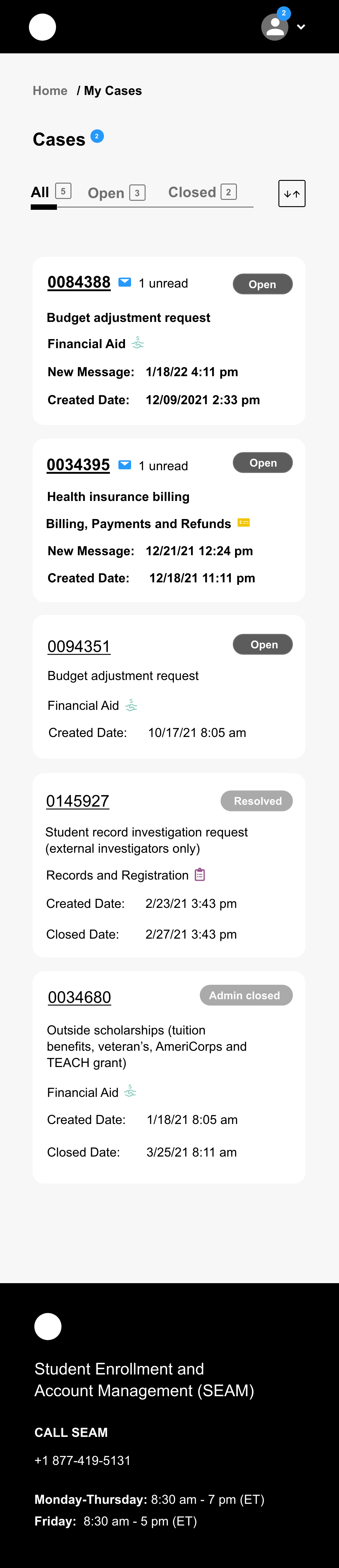
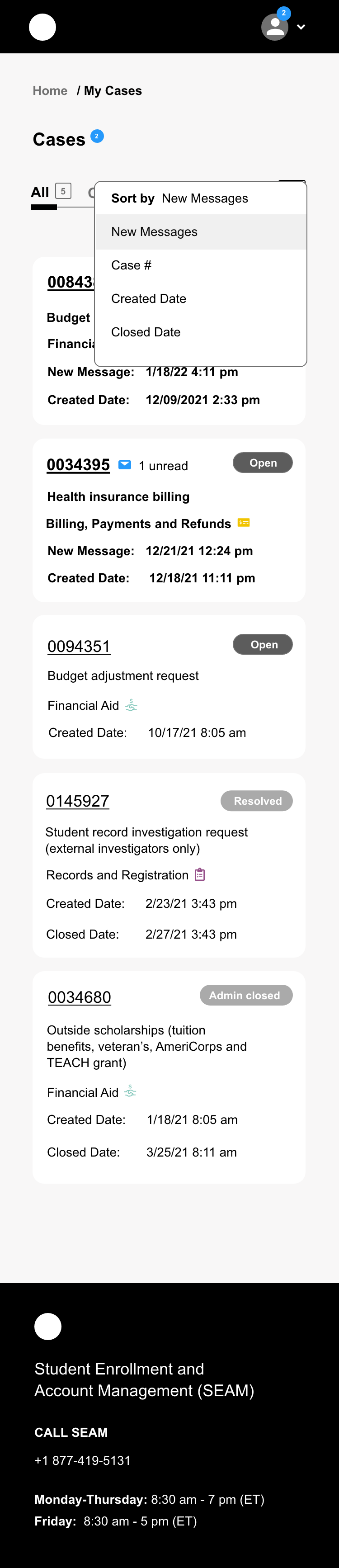
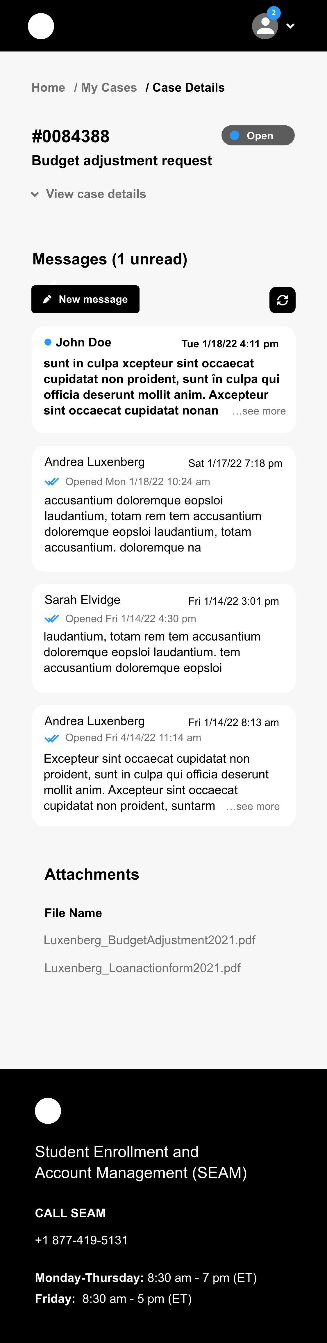
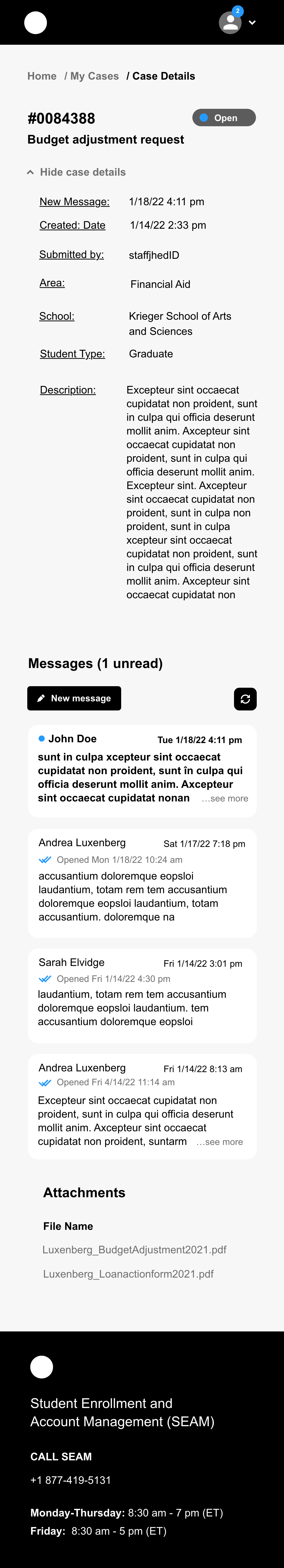
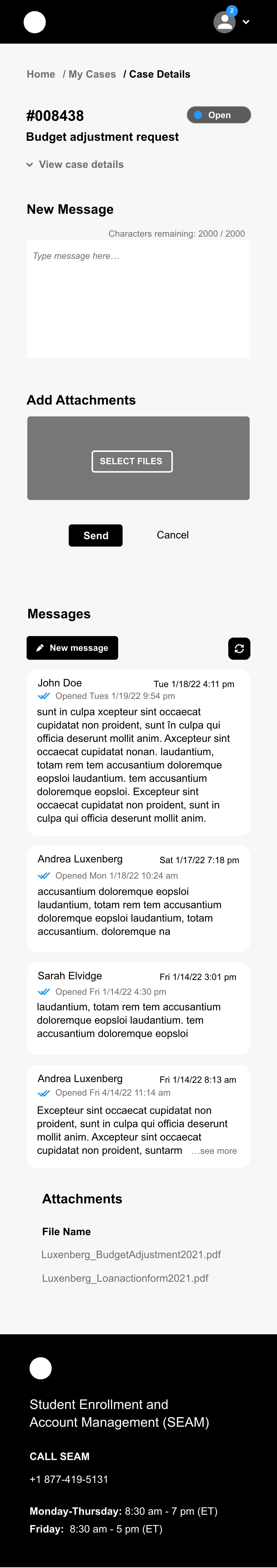
As we create more transparent communication channels, we want the case management tool to act as the hub of information for student requests. We added the ability for students to see the cases they have submitted. We added the following features based on user feedback.
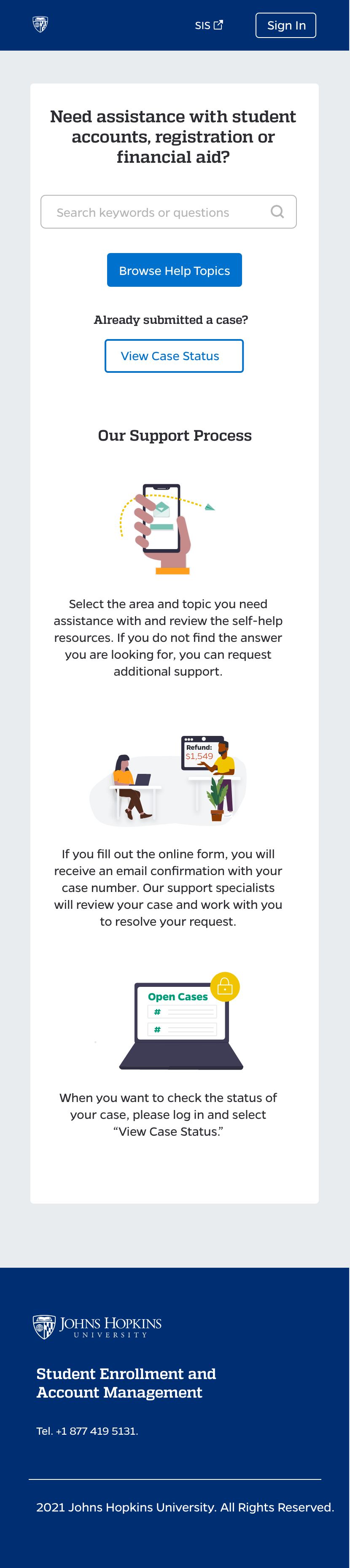
As shown on our user journey, students often get to the case management system because they simply can't find or get an answer at Hopkins. They start off the process a bit frustrated. Once they submit a case, they have to dig through emails to reference the information, which can be frustrating. Since the main communication strategy for Hopkins is email, we flood our students with communication. We even have students who created email folders for the case management tool.
In order to increase transparency and help students and staff communicate more effectively on cases, we are designing and testing the My Messages feature. Our hypothesis is this feature will help users stay organized of the updates on their case(s). Users will still receive an email update when there is an update to their case with a link to the case management tool. We are working on designing a new digital experience layer which will be able to surface updates from case management system in a centralized place with our student information system. We hope this alleviates the challenge students have of remembering how to submit a case.
In 2021, about 100,000 cases were submitted. 188 users have rated their experience from 1 (very bad) to 5 (great), we received a 2.7 out of 5 stars. On a scale from 1(very slow) to 5 (very fast), we received a rating of 2.8.
We expect the My Messages feature will improve the speed, accuracy and transparency of the student support experience. It will help students track their requests in one place. If our tool and service can give provide quicker and more personalized advice, it will live up to our goal of providing the best user experience possible. As we invest in technologies such as a knowledge base, we will give customized content to our users so they can answer their own questions.
Academia has a tendency to market offices and products internally. While we do need to differentiate our support team, we may have caused unnecessary confusion. I recommended just using titles to differentiate that this is a new type of role and a new system. Another alternative would be to try to add more support staff under SEAM so that they take on the role of triaging all student questions as account management is a broad term.
I feel that we could have been more transparent in our messaging about SEAM and how though we intend to be the fastest way to get help, we are working on improving our response times. The tool still comes across like a wall between staff and students and removes the personal touch and feel. In addition to new features, I hope that we can use friendlier language and work on the brand identity.